Droplist widgets
A droplist — also known as a drop-down list, a drop-down menu, or a pull-down menu — is a toggleable list that contains several options of which only one can be selected at a time. The droplist widget is located in the Forms section of the Default widget library.
Use a droplist widget in a user input form when you want the user to select a single answer for a question from among many possible answers. For example, choosing a country from the long list of all the world's countries is typically done with a droplist.
Adding, removing, and reordering droplist options

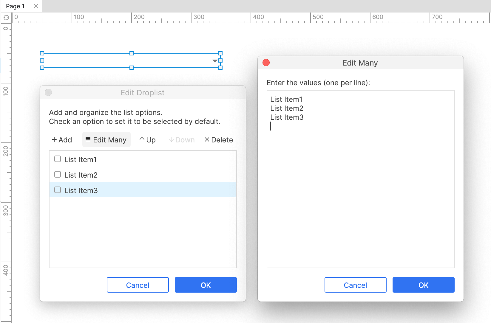
To add and edit options in a droplist, double-click the droplist widget on the canvas or in the Outline pane to open the Edit droplist dialog. You can add a single option to the droplist by clicking Add and typing the text of the new option in the field that appears. Alternatively, you can add several new options to the droplist at once by clicking Edit many.
To reorder the droplist options, select an option and use the Up and Down buttons at the top of the dialog. To delete an option, select it and click the Delete button, or click the Edit many button and clear the text area to delete all the options at once.
Defining the default option
Normally, the first option in the droplist will appear as the default option. As such, you can move an option to the top of the list if you want it to be the default.
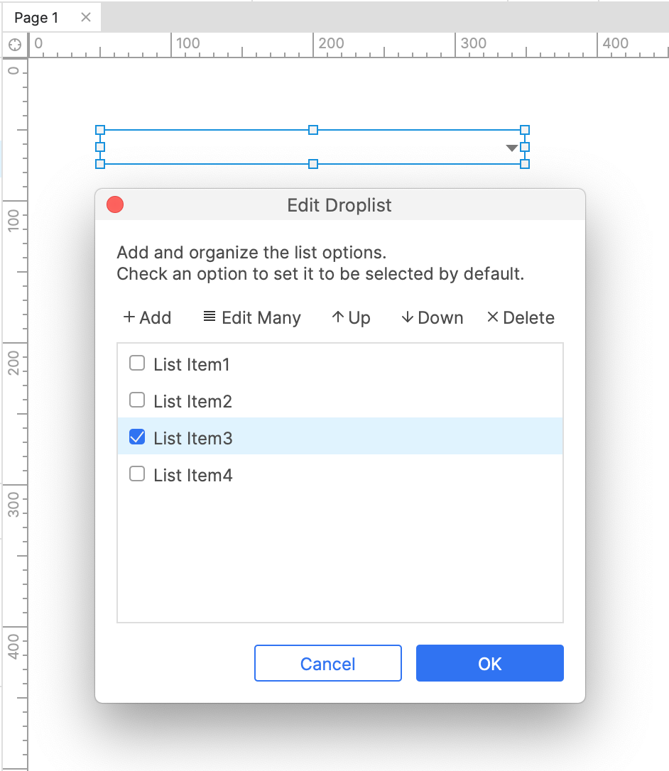
If, however, you would like a lower-down option to be the default, check the box next to it in the Edit droplist dialog. This will make the checked option the default instead of the first option.
To add a blank default option to a droplist, enter a single space character as the option's text.

Special properties
Disabled
Disabling a droplist prevents users from interacting with it in the web browser. This also activates the widget's Disabled style effect, making it appear greyed-out.
There are two ways to disable a widget:
-
Check the Disabled checkbox at the bottom of the Interactions pane.
-
Disable the widget dynamically in the web browser with the Enable/disable action. You can do this as part of any interaction, such as when the page loads or when a button is clicked.
You can dynamically enable a disabled widget in the web browser with the Enable/disable action. Check out the Terms and conditions tutorial for an example of how this can be done.
Special interactions
Selecting a list option
In the web browser, you can click a droplist to open it and select an option.
You can also dynamically change the selected option in a droplist with the Set selected list option action. You can choose a specific list option or use a variable value to set the new selected option.
Capturing and evaluating the selected option
You can access the selected option of a droplist via the selected option of value option in interactions and conditions. For example, you can set the value of a global variable to the selected option of a droplist in order to carry that value over to a different page. You can also evaluate the selected option of a droplist in a condition so that a certain case will only fire if the option matches a particular value.
Submit button
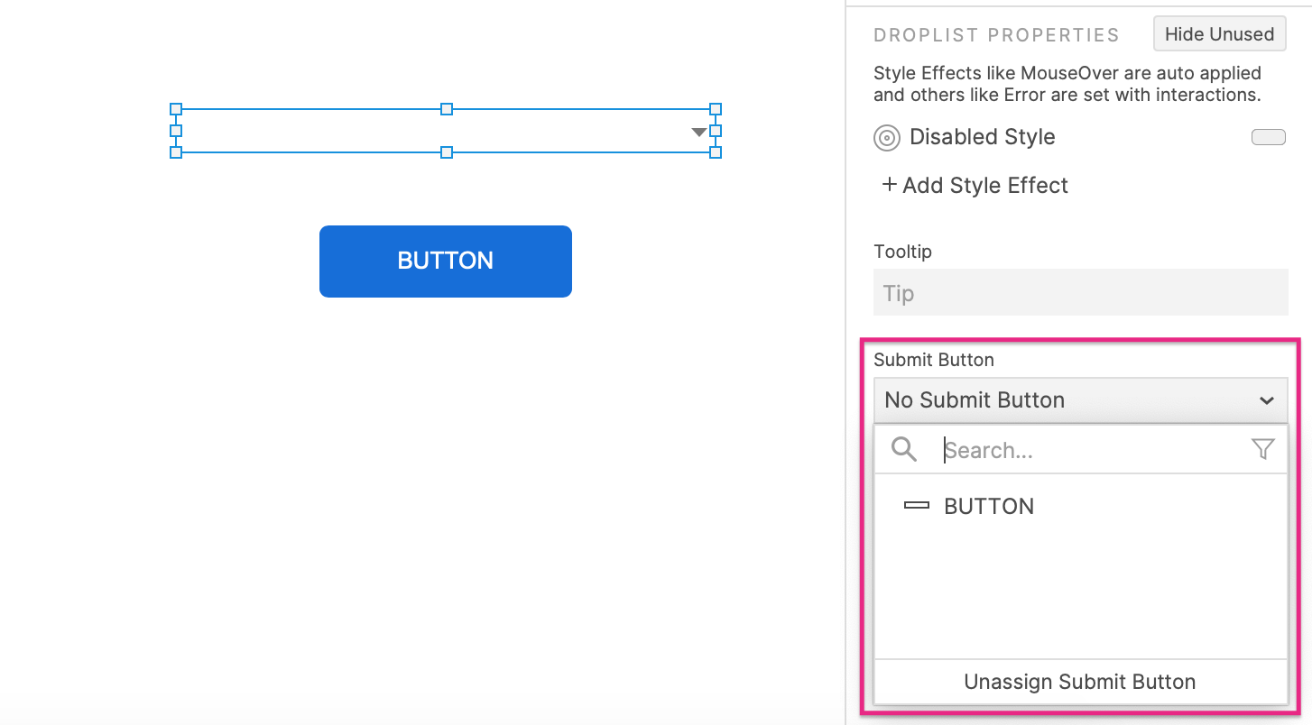
Pressing ENTER while a droplist has focus in the web browser can fire the Click or tap event of another widget on the page, known as the droplist's "submit button."
To assign a submit button to a droplist:
-
Select the droplist and click Show all in the lower section of the Interactions pane.
-
Choose from a list of eligible widgets in the Submit button dropdown.
To unassign the submit button, click Unassign submit button at the bottom of the dropdown.

Limitations and workarounds
Dynamically adding and removing droplist options
The options available in a droplist cannot be dynamically altered in the web browser, but you can simulate the effect by making a dynamic panel with multiple states, each containing a droplist with different contents. When you want the options in your droplist to change, switch the dynamic panel's state.
Tab order
Tab order for droplists and other form widgets is determined by their layer depth, as shown in the Outline pane. You can learn more about this and how to change a widget's tab order in the Organizing Widgets article.