Radio button widgets
A radio button is a form control that allows a user to choose a single option from among several. For example, if a user is asked to enter a phone number, they could then choose from a group of radio buttons to indicate whether the number is for their home, work, or cell phone.
The radio button widget is located in the Forms section of the Default widget library.
Radio groups

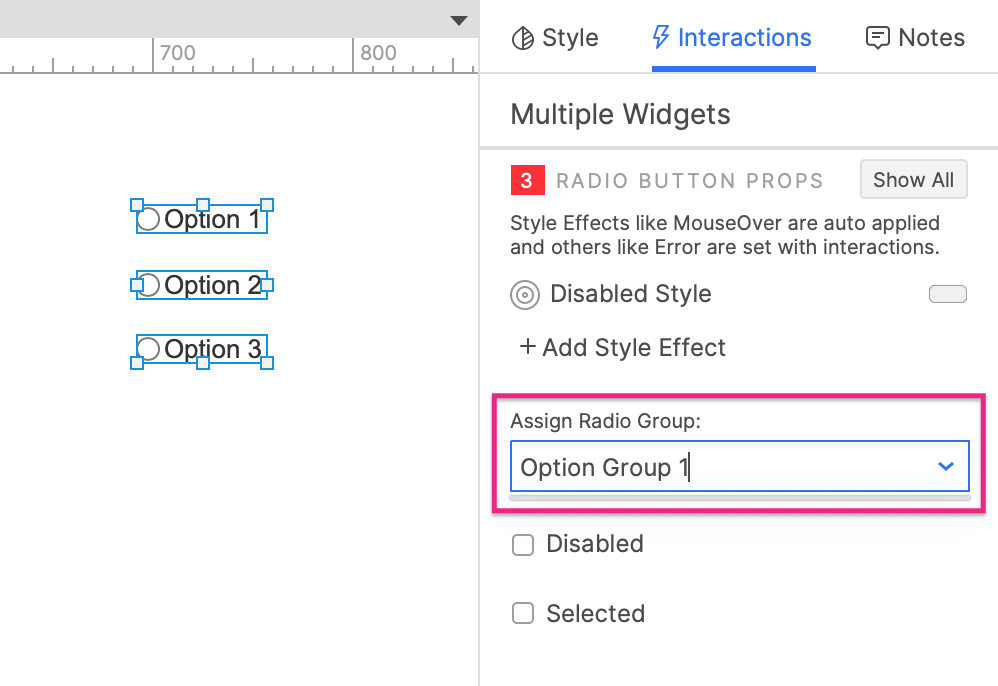
In most design patterns, selecting a radio button will automatically deselect any previously selected radio button in the same group. In Axure RP, you can create this relationship between a set of radio buttons by adding them to a "radio group":
-
Select one or more radio button widgets on the canvas or in the Outline pane.
-
In the Interactions pane, enter a name for the new radio group in the Assign radio group field.
-
Add more radio buttons to the radio group by selecting them and choosing the radio group name in the Assign radio group dropdown.
-
Remove a radio button from the radio group by selecting it and clearing the Assign radio group field's selection.
Removing all radio buttons from a radio group will delete the group.
Button size and alignment
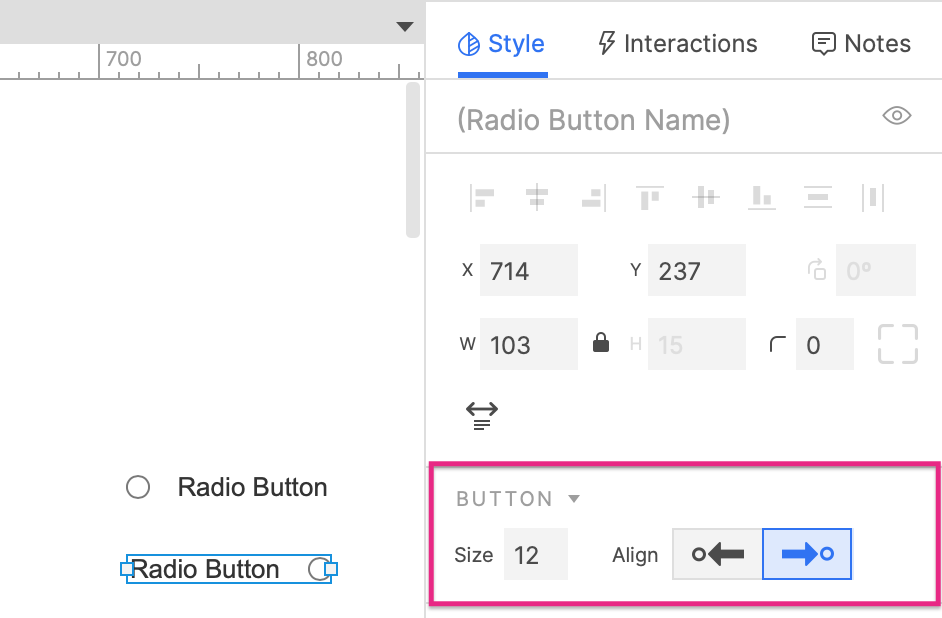
In the Button section of the Style pane, you can use the Size field to set the width and height of the button portion of the radio button.
By default, the button portion of a radio button is on the left, and the label text is on the right. To swap the order so that the text is on the left and the button is on the right, use the Align icons to the right of the Size field.

Align the button to the right when prototyping forms in right-to-left languages, such as Arabic or Hebrew.
Editing the label text
You can edit the text on a radio button widget's label via any of the options below:
- Double-click the button label to enter text-editing mode
- Select the button label and press ENTER to enter text-editing mode
- Right-click the button label and select Edit text in the context menu
- Select the button label and begin typing. (This option is only available if you have disabled the single-key shortcuts)
Special properties
Selected by default
By default, a radio button begins in its unselected state when the page first loads in the web browser.
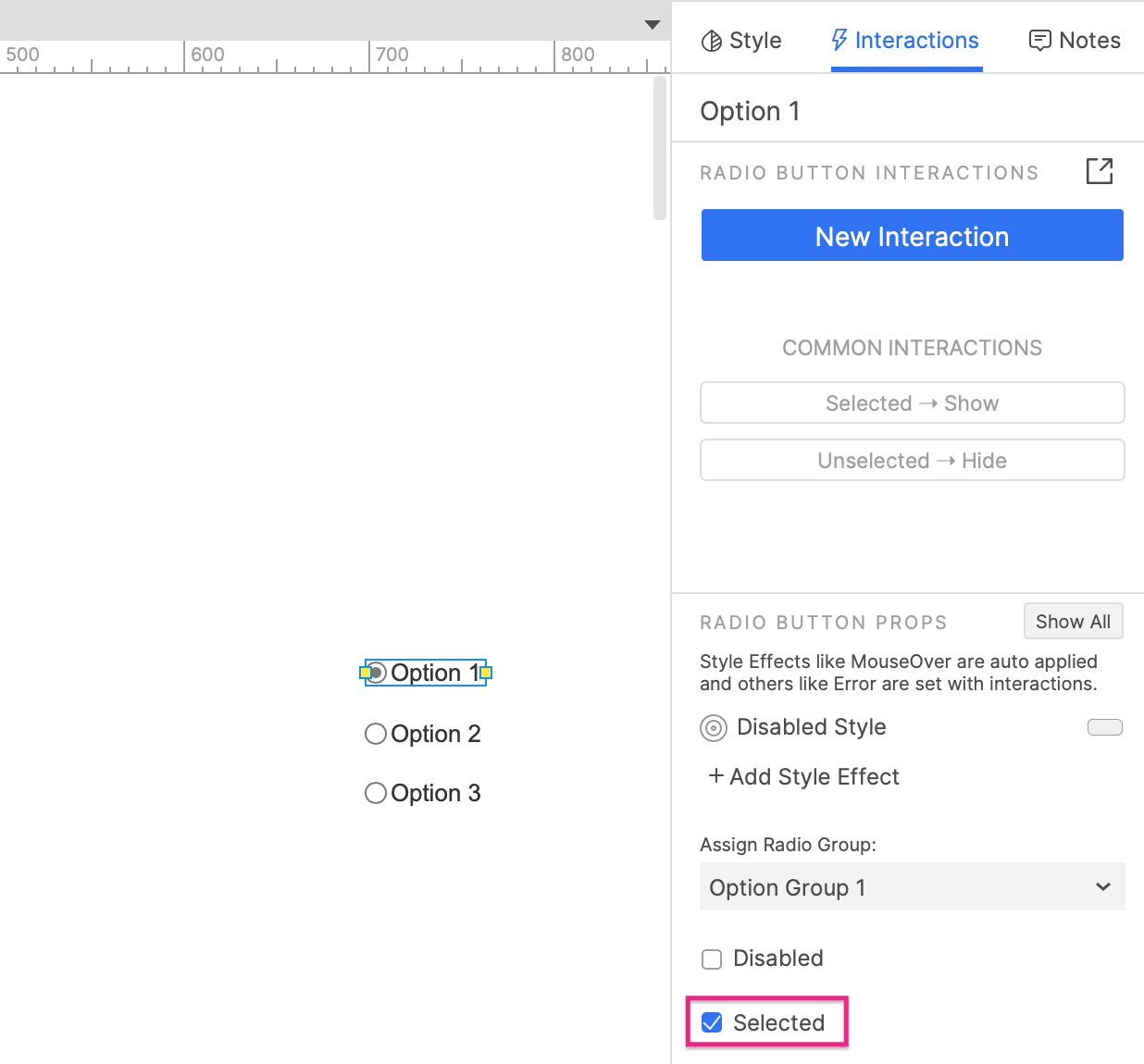
To instead have a radio button begin in its selected state, select the radio button and click its button on the canvas.
You can also check the Selected option in the Interactions pane.

Disabled
Disabling a radio button prevents users from interacting with it in the web browser. This also activates the widget's Disabled style effect, making it appear greyed-out.
There are two ways to disable a widget:
-
Check the Disabled checkbox at the bottom of the Interactions pane.
-
Disable the widget dynamically in the web browser with the Enable/disable action. You can do this as part of any interaction, such as when the page loads or when a button is clicked.
You can dynamically enable a disabled widget in the web browser with the Enable/disable action. Check out the Terms and Conditions tutorial for an example of how this can be done.
Special interactions
Selecting a radio button
In the web browser, you can click a radio button to select it.
You can also dynamically select a radio button with the Set selected/checked action. The true option will select the radio button, and the false option will deselect it. The toggle option will set the radio button to the opposite of the state it's in when the interaction occurs.
Capturing and evaluating the selected state
You can determine whether or not a radio button is selected via the is selected of value option in interactions and conditions. The value "true" is returned if the radio button is selected, and "false" is returned if the radio button is not selected.
Submit button
Pressing the ENTER key while a radio button has focus in the web browser can fire the Click or tap event of another widget on the page, known as the radio button's "submit button."
To assign a submit button to a radio button:
-
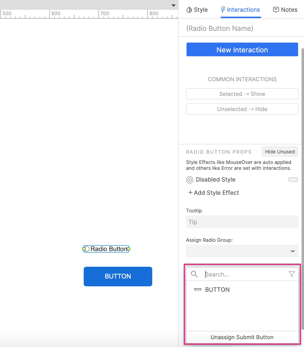
Select the radio button and click Show all in the lower section of the Interactions pane.
-
Choose from a list of eligible widgets in the Submit button dropdown.
To unassign the submit button, click Unassign submit button at the bottom of the dropdown.

Tab order
Tab order for radio buttons and other form widgets is determined by their layer depth, as shown in the Outline pane. You can learn more about this and how to change a widget's tab order in the Organizing Widgets article.