Terms and conditions tutorial
In this tutorial, you'll learn how to create a form that requires the user to check a checkbox and enter their name before proceeding.
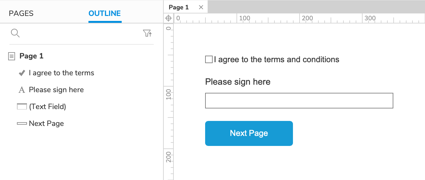
1. Widget and page setup
Page 1 – the terms and conditions form
-
Open a new RP file and open Page 1 on the canvas.
-
Drag a checkbox widget, a label widget, a text field widget, and a button widget onto the canvas.
-
Set the text on the checkbox to
I agree to the terms and conditions. -
Set the text on the label widget to
Please sign hereand place it above the text field. -
Set the text on the button to
Next Page
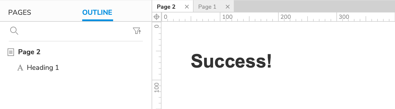
Page 2 – The success page
-
Add a new page to the project and open it on the canvas.
-
Drag a heading widget onto the canvas and set its text to
Success!
2. Disable the text field while the checkbox is unchecked
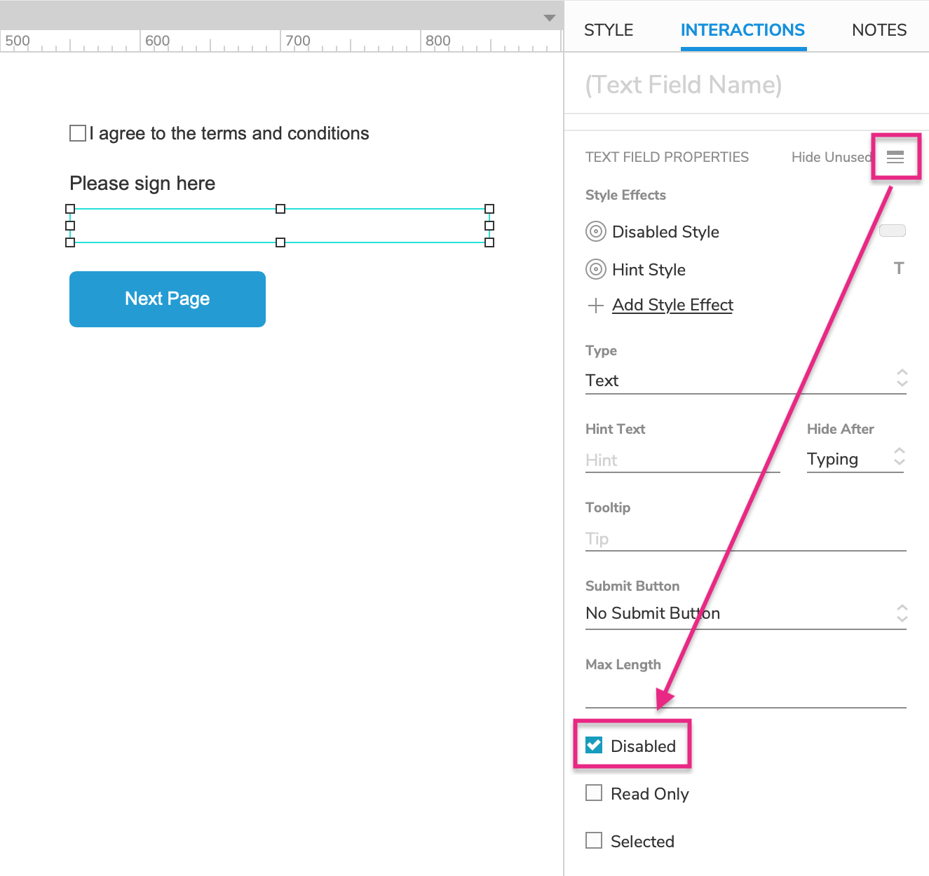
Make the text field disabled by default
-
Open Page 1 and select the text field widget.
-
In the Interactions pane, click the Show All icon and check the box for Disabled.
This will trigger the text field's default Disabled style effect, turning it grey. It will also prevent users from interacting with the text field in the web browser.
Enable the text field when the checkbox is checked
-
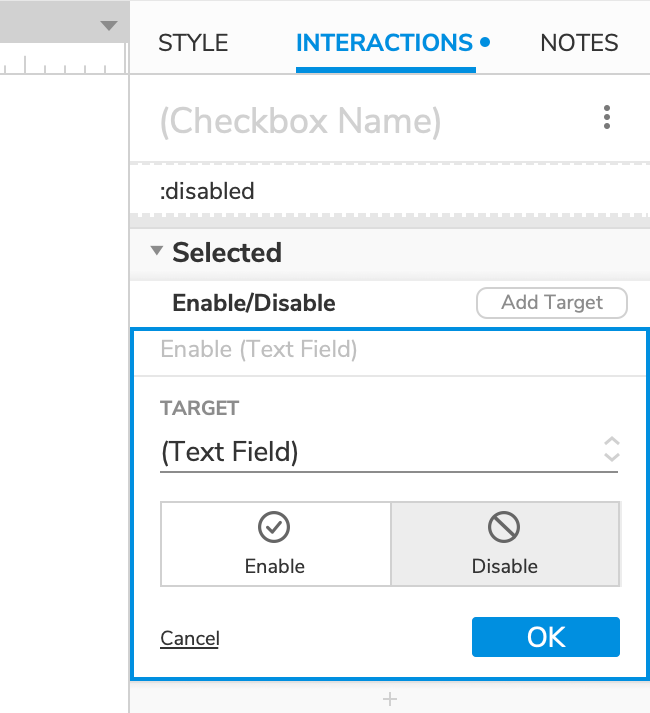
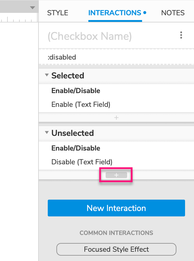
Select the checkbox widget and click New interaction in the Interactions pane.
-
Select the Selected event in the list that appears, and then select the Enable/disable action.
-
Select the text field widget in the Target dropdown and leave Enable selected below it.
-
Click OK to save the action.
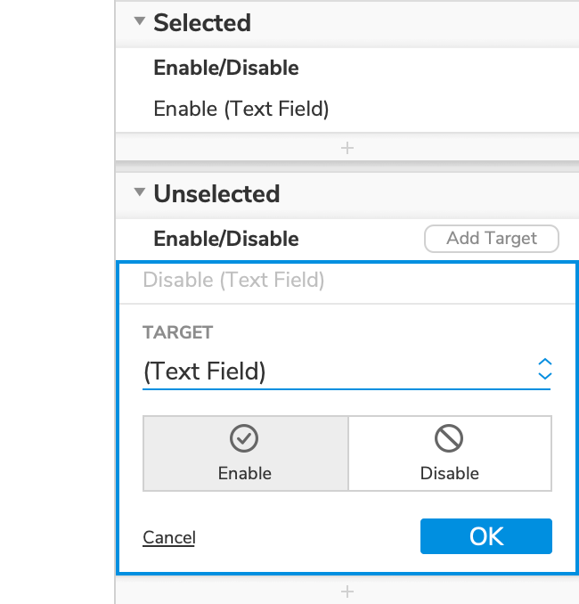
Disable the text field again when the checkbox is unchecked
-
With the checkbox widget still selected, click New interaction in the Interactions pane once again.
-
Select the Unselected event in the list that appears, and then select the Enable/disable action.
-
Select the text field widget in the Target dropdown, and then select Disable below it.
-
Click OK to save the action.
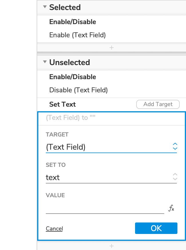
Clear the text field's text when the checkbox is unchecked
-
With the checkbox widget still selected, click the Insert action icon at the bottom of the Unselected block and select the Set text action in the list that appears.
-
Select the text field widget in the Target dropdown.
-
Leave the Value field blank. (This will clear the text field's text.)
-
Click OK to save the action.
3. Disable the next page button until the user has signed
Make the button disabled by default
-
Select the button widget.
-
In the Interactions pane, click the Show all icon and check the box for Disabled.
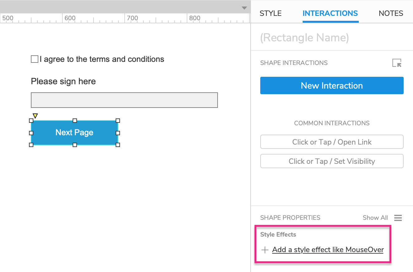
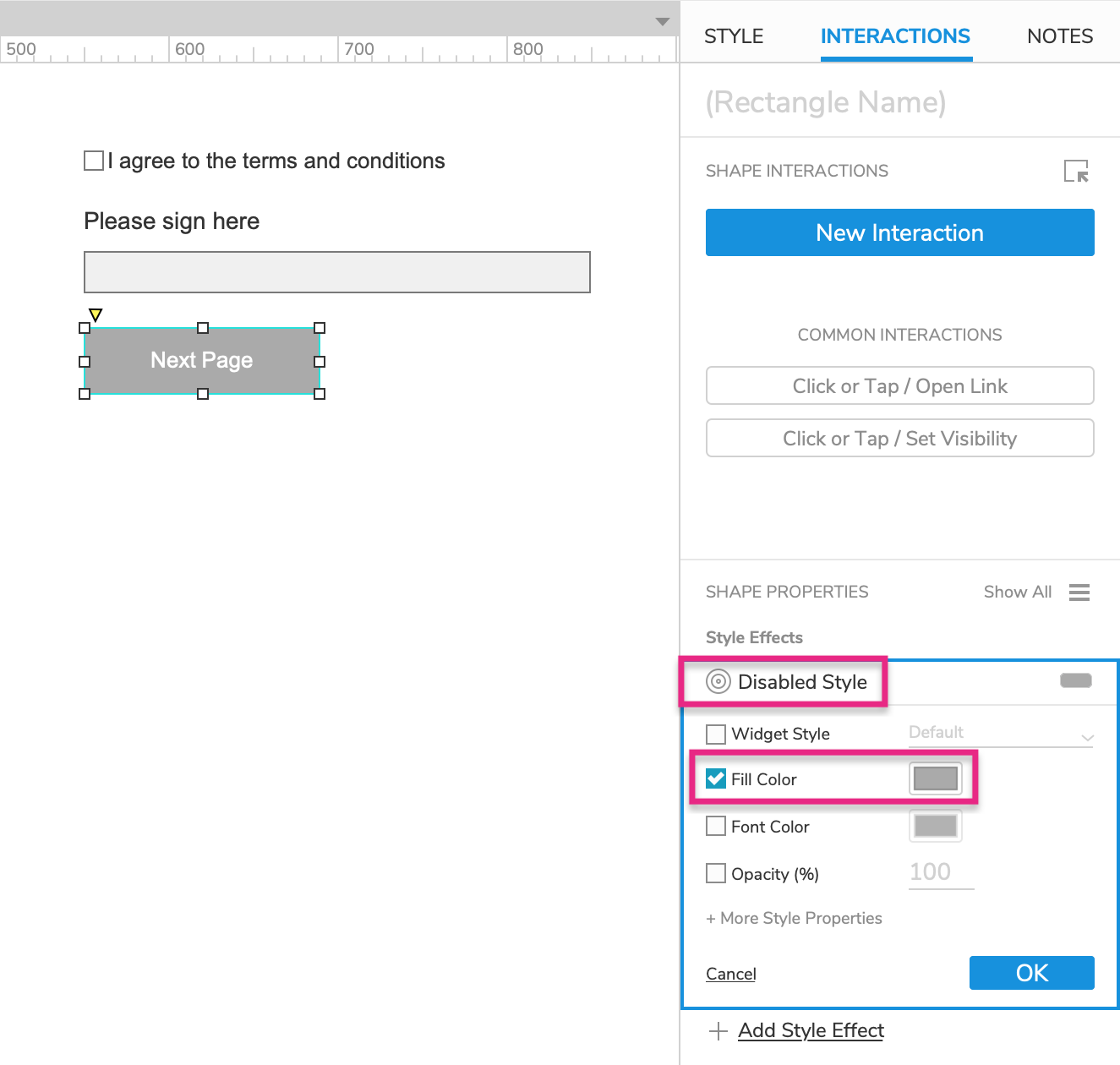
Give the button a disabled style effect
-
With the button widget still selected, click Add a style effect in the Interactions pane.
-
In the list that appears, select the Disabled style effect.
-
In the Disabled block that appears, check the Fill color property and choose a grey color in the color picker.
-
Click OK to save the style effect.
Enable the button when the text field contains text
-
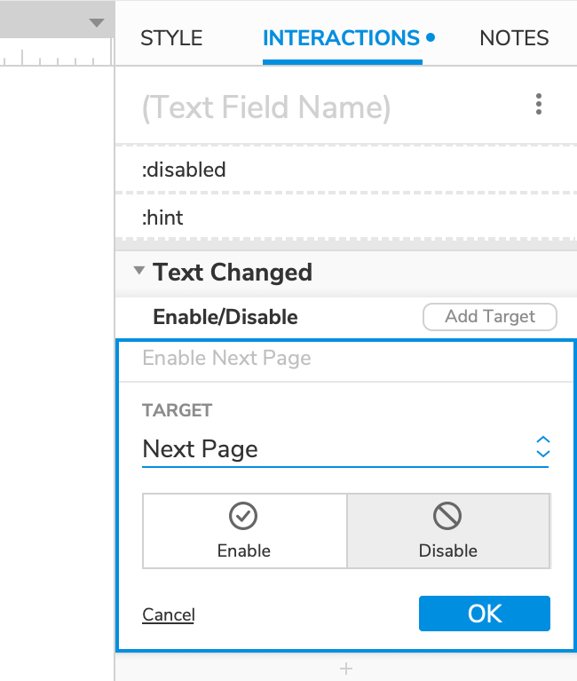
Select the text field widget and click New interaction in the Interactions pane.
-
Select the Text changed event in the list that appears, and then select the Enable/disable action.
-
Select the Next page button in the Target dropdown and leave Enable selected below it.
-
Click OK to save the action.
-
With the text field still selected, hover over the Text changed heading in the Interactions pane and click Enable cases to the right.
-
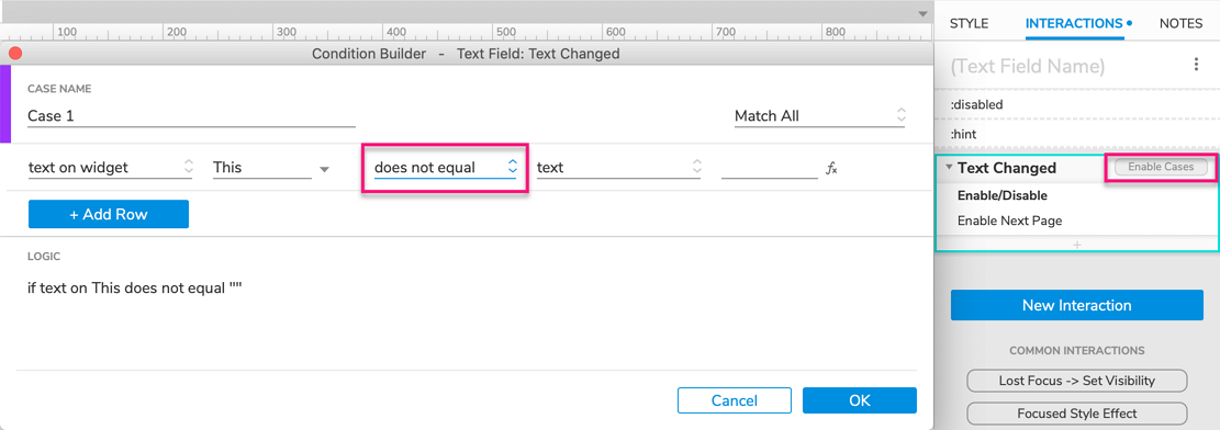
In the Condition builder dialog that appears, click Add logic.
-
In the condition row that appears, select does not equal in the middle dropdown.
The summary at the bottom of the dialog should read:
If text on This does not equal "". This condition will be met so long as the text field is not blank (once the user enters text in it). -
Click OK to close the Condition builder dialog.
Disable the button again when the text field is cleared
-
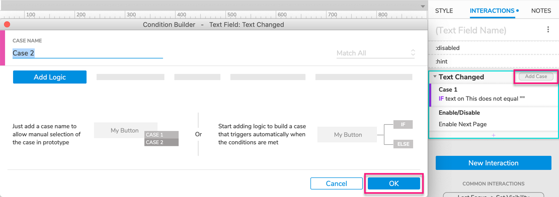
With the text field widget still selected, hover over the Text changed heading in the Interactions pane and click Add case to the right.
-
In the Condition builder dialog that appears, click OK without adding any logic.
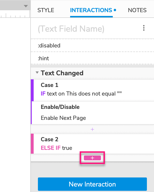
-
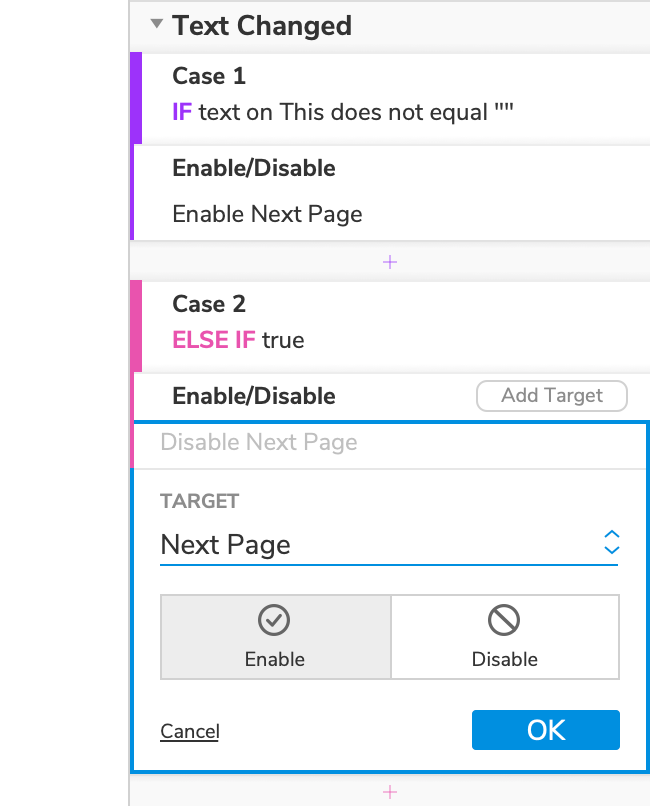
Click the Insert action icon beneath the new case heading, and select the Enable/disable action in the list that appears.
-
Select the Next page button in the Target dropdown and select Disable below it.
-
Click OK to save the action.
Notice that even though we didn't set up a condition for this case, it has the condition ELSE IF true. This case, also known as a "default" case, will fire if the first case's condition doesn't pass (if the text field's text gets cleared).
4. link the next page button to page 2
-
Select the Next page button and click Click or tap → Open link in the Interactions pane.
-
Select Page 2 in the list that appears, and then click OK to save the action.
5. Preview the interaction
-
Preview Page 1 and try clicking on the text field and the Next page button. Both are disabled, so nothing should happen.
-
Check and uncheck the checkbox a few times. The text field should be alternately enabled and disabled.
-
Enter some text in the text field and then clear it again, either by manually deleting the text or by uncheck the checkbox. The Next page button should be enabled and then disabled again.
-
Complete the form and click the Next page button. You should be taken to Page 2.