Adaptive views
Adaptive views are alternate versions of pages designed for specific screen sizes. They allow you to create a page once and then rearrange, resize, and restyle its widgets to fit each screen size you intend to test it on. When you view the page in a web browser, the appropriate view for the browser dimensions will be shown automatically.
Adding adaptive views to a page
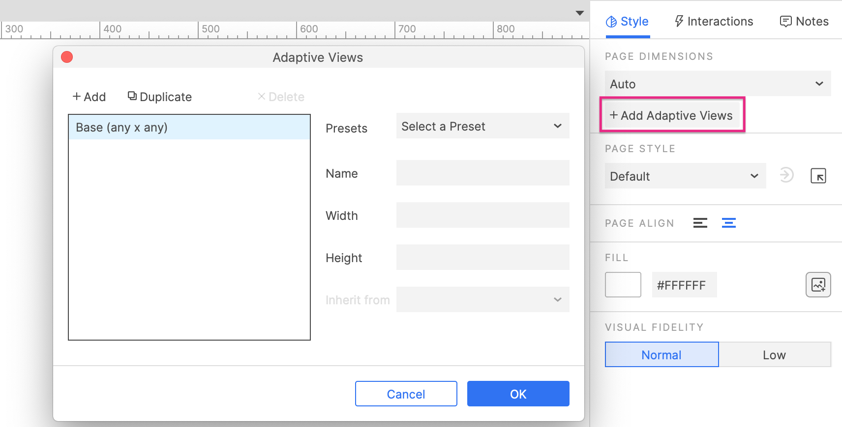
To add adaptive views to a page, start by clicking the canvas to focus the page itself. Then, click Add Adaptive Views in the Style pane.
If you've already created a set of adaptive views elsewhere in the project, you'll be prompted to choose from your existing sets or create a new one. If you haven't yet created any adaptive views, you'll be taken directly to the Adaptive Views dialog, where you can create a new set of views.
To remove adaptive views from a page, click Remove Views at the top-right of the Style pane.

Creating and managing adaptive views
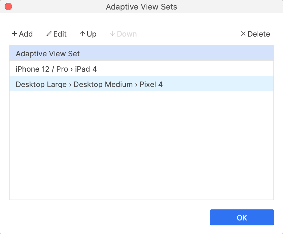
Adaptive views are organized into sets, and you can have multiple sets in a project. To create new adaptive view sets or edit your existing ones, click Add/Edit Adaptive Views at the top of the Style pane (with a page focused), or use the Project → Adaptive View Sets menu option.
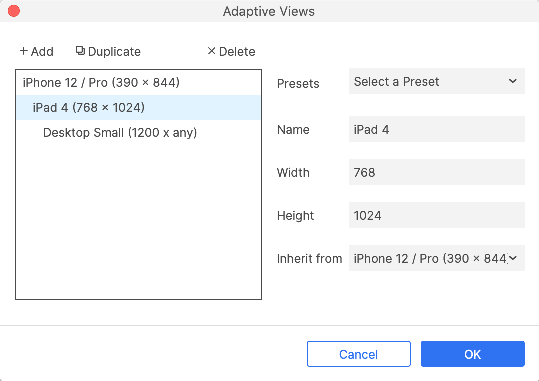
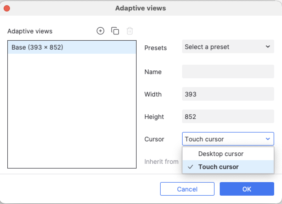
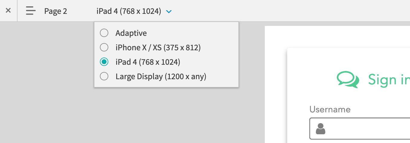
To add a new adaptive view to a set, click Add at the top-left of the Adaptive views dialog, and then configure the view with the fields on the right. You can define your own custom page dimensions or select from a number of popular device dimensions in the Presets dropdown.
New views are automatically assigned a parent view to inherit from, but you can select a different parent for a view at any time in the Inherit dropdown.
A mobile touch cursor will be used by default for any adaptive view with a defined height. You can override this with a desktop cursor in the Cursor dropdown.
Adaptive view inheritance
Adaptive view sets contain a series of views organized into a chain of inheritance. The first link in that chain, the view from which all others inherit, is the Base view. Each view you add to a set inherits its widgets and widget properties either directly from the Base view or from another view in the set.
For example, the chain of inheritance for a simple mobile-first project might looks like this:
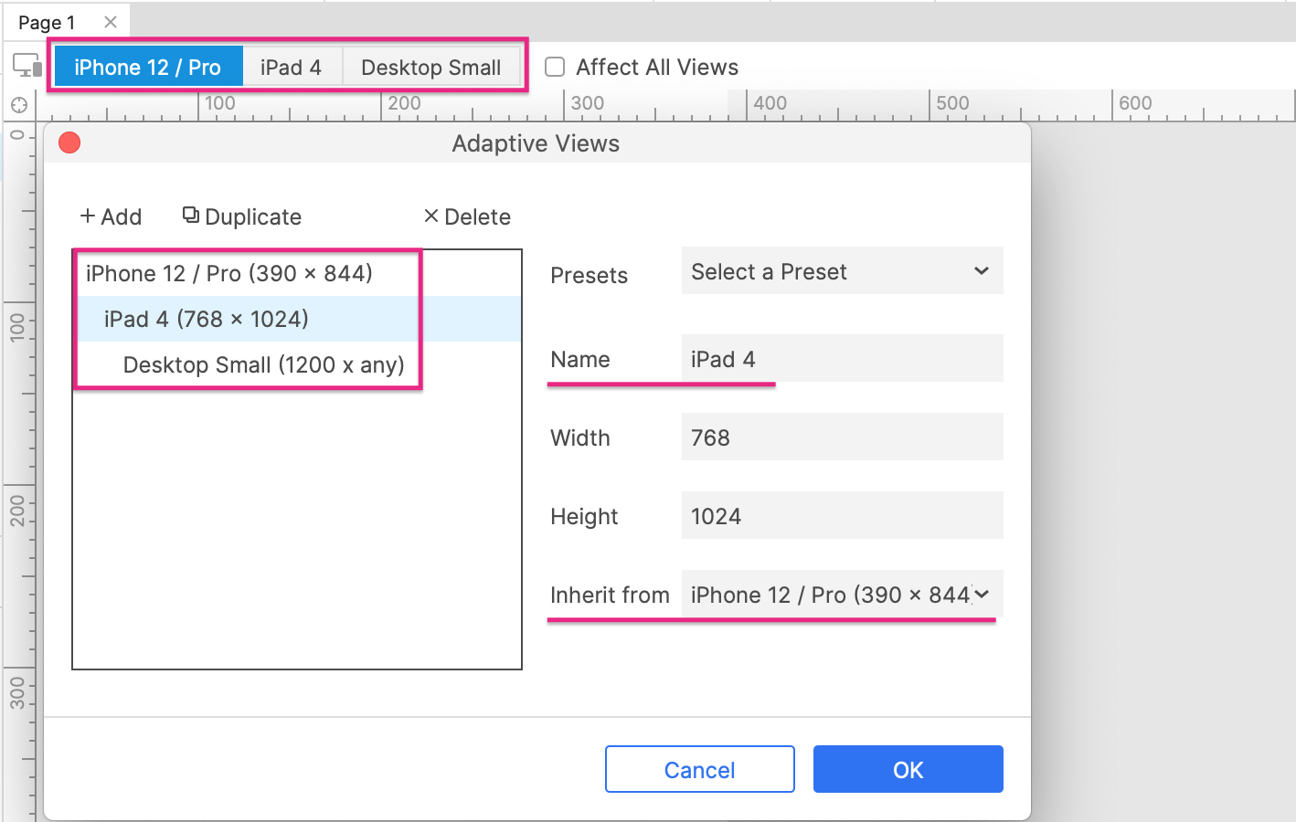
iPhone 12 (Base) > iPad 4 > Desktop small
-
Edits made in the iPhone view would be reflected in both the iPad and Large Display views as well.
-
Edits made in the iPad view would be reflected in the Large Display view but not in the iPhone view.
-
Edits made in the Large Display view would only affect that view.
If your project calls for more platform granularity, you can create multiple chains of inheritance. For example, you may want one chain for Android devices, one for iOS devices, and one for desktop browsers. Generally speaking, though, we recommend you use only a single chain of inheritance while you're learning to work with this feature.
Editing diagrams in adaptive views
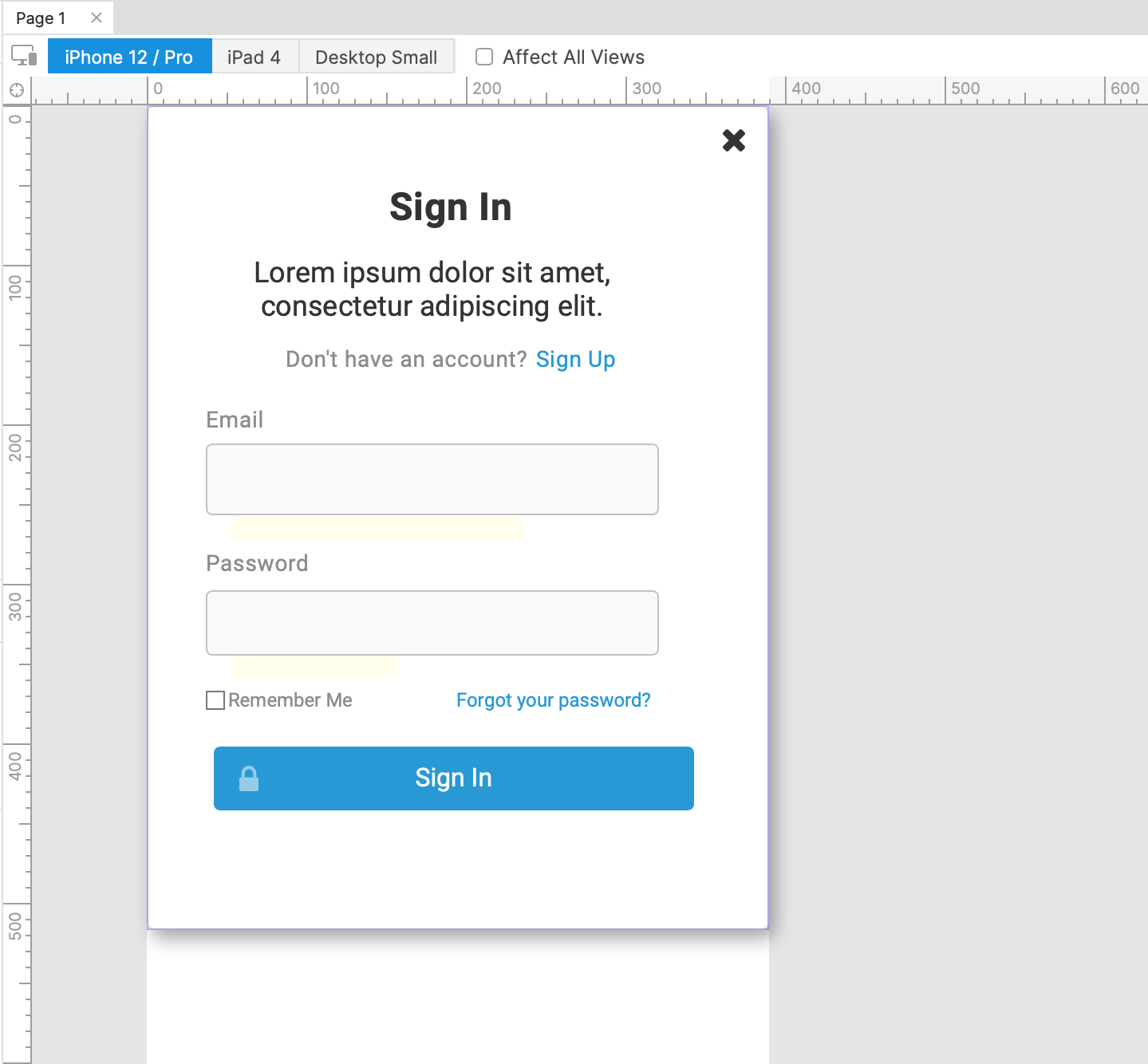
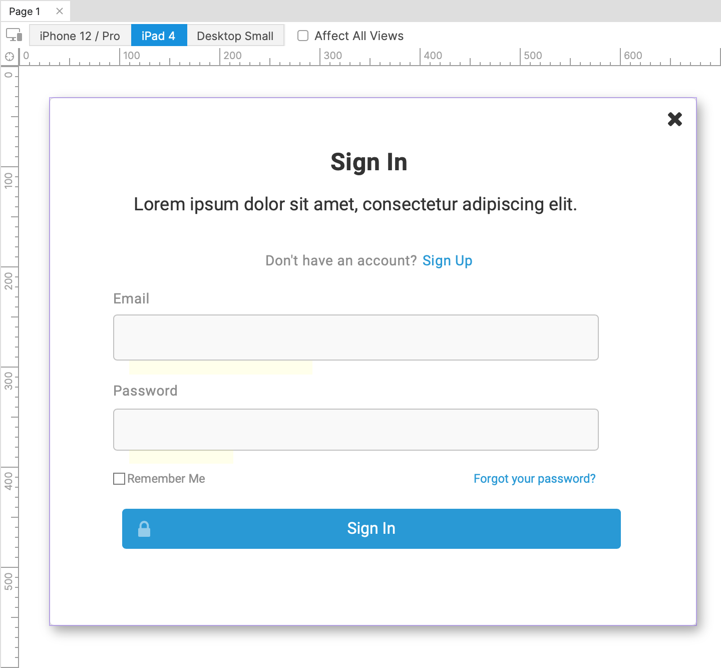
Once you've added a set of adaptive views to a page, you can access each view by clicking its name at the top of the canvas. The color of a view's name indicates whether it will be affected by edits you make on the canvas:
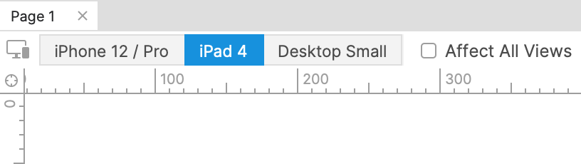
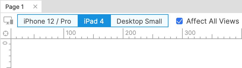
- Dark blue: The view currently displayed on the canvas. Edits will affect this view.
- Light blue: The Affect all views checkbox is checked. Edits will affect all views.
- Grey: The Affect all views checkbox is unchecked. Edits will not affect all views.
Furthermore, if you edit a widget property in a child view, edits to the same property in a parent view will no longer affect the child view. For example, if you change a button's fill color to pink in a child view and then change that same button's fill color to green in the parent view, the button will still be pink in the child view, not green.
To take full advantage of the benefits of adaptive view edit inheritance, we suggest you take a top-down approach to editing your diagrams, starting in the Base view and then working your way down the chain.
Nonadaptive widget properties�
You can change the visual styling, size, and position of widgets freely across adaptive views. Some widget properties, however, are always the same in every view. These include widget text, notes, and interactions/interactive properties. Making edits to these on a widget in one view will always affect all other views as well.
Additionally, special widget properties like the options in a droplist widget, the rows and columns in a table widget, and the nodes in a tree widget, are also not adaptive.
If you need a nonadaptive widget property to vary across your adaptive views, create an additional copy of the widget for each variation and use the "unplace" feature to choose which version of the widget appears in each view.
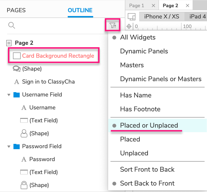
Unplaced widgets
"Unplaced" widgets are widgets that are included in some of a page's adaptive views but not in others. Any unplaced widgets in the current view are listed in red in the Outline pane.
To ensure that you see both placed and unplaced widgets in the Outline pane, click the Sort and Filter icon at the top-right of the pane and select Placed or Unplaced.
There are two ways to unplace a widget from a view:
-
You can unplace a widget from the current view and its children by right-clicking the widget and selecting Unplace from View. You can also do this by selecting the widget and pressing DELETE.
-
If you add a new widget to a child view, the widget will be automatically unplaced from all parent views (unless Affect All Views is checked).
If you DELETE a widget from the base view or while Affect All Views is checked, the widget will not be unplaced; instead, it will be deleted from all views.
You can place an unplaced widget in the current view and its children by right-clicking it and selecting Place in View.
To delete a widget from all views entirely, right-click it and select Delete from All Views. This will completely remove the widget from the page instead of just unplacing it.
Switching between adaptive views in the web browser
When you view an adaptive project in the web browser, you'll automatically be shown the largest view that fits within your browser's width. For example, if the project includes a 320px view and a 768px view, you'll see the 320px view in any browser that's narrower than 768 pixels.
If you'd like to see a different view, use the Adaptive Views dropdown in the prototype player. Select one of the project's views, or select Adaptive to switch back to the view that best fits your web browser's width.
Switching between views interactively
You can switch the adaptive view displayed in the web browser interactively with the Set Adaptive View action.