Style effects
Style effects are alternative widget styles that are automatically applied to a widget while it's in a particular state in the web browser, such as while being moused over or clicked. When the widget enters the triggering state, the style effect is applied. When the widget exits the triggering state, the style effect is removed and the widget reverts back to its base styling.
Some common examples include:
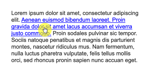
- text links gaining an underline when moused over
- buttons changing colors when clicked
- text fields gaining a different border color when focused or when error state is applied.
You can assign as many style effects to a widget as you'd like.
Check out the interactive button tutorial to learn how to use style effects with buttons.
The style effects
MouseOver
Applied when the mouse cursor is moved over the widget. (Added to text links by default.)
MouseDown
Applied when the widget is clicked, while the mouse button is pressed down. (Added to text links by default.)
Selected
Applied when the widget is set to its selected state with a Set selected action or automatically when a checkbox or radio button is clicked.
Disabled
Applied when the widget is set to its disabled state by the Disable action. (Added to form widgets like text fields and droplists by default.)
Error
Applied when the widget is set to its error state by the Error state set action.
Focused
Applied when the widget has focus in the web browser. Form widgets like text fields and droplists automatically gain browser focus when they're clicked on or tabbed to. You can also dynamically give a widget browser focus with the Focus action.
Hint
Defines the styling of the hint text on a text field or text area. (Enabled on these widgets by default.)
Enabling style effects
To enable a style effect on a widget:
-
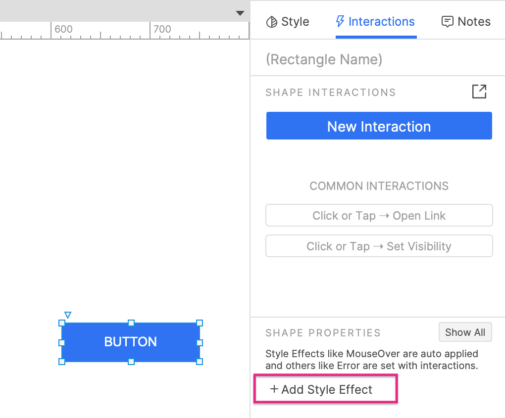
Select the widget and click Add style effect in the Shape properties section of the Interactions pane.
-
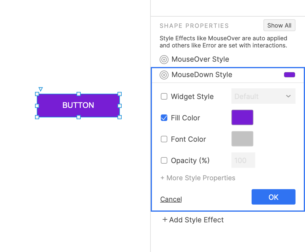
Choose your desired style effect from the list.
-
In the block that appears, select the style properties you want to alter for the style effect.
You can see the full list of style properties by clicking More style properties.
As you edit a style effect, the changes you make will be temporarily applied to the widget on the canvas. When you close the style effect's block in the Interactions pane, the widget will go back to its default styling.
If you want to use the same style effect selections for multiple widgets, create a widget style to hold your style selections. Then when you enable the style effect on a widget, select the widget style in the widget style dropdown.
If you make changes to the widget style in the future, the changes will be applied automatically to all widgets using it.
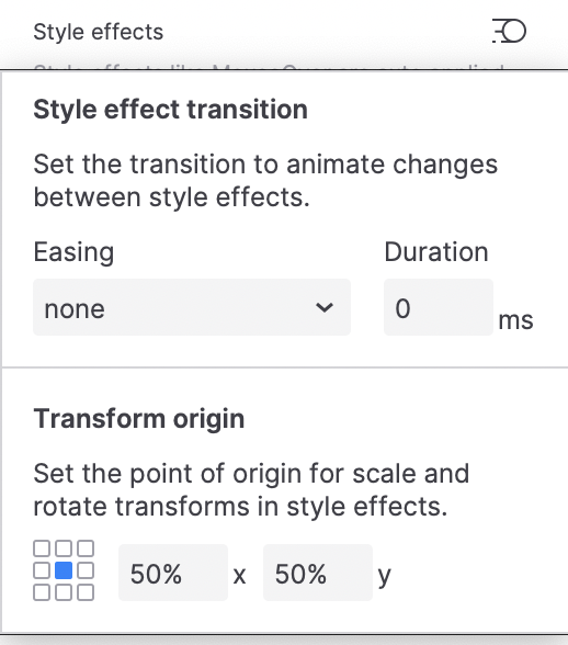
Transition and Origin
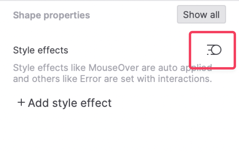
You can set the animation and duration of transitions between style effects by clicking the Transition and origin icon under Shape properties.
You can also set the point of origin for scale and rotate transforms.
Copy and paste style effects
You can copy and paste style effects from one widget to another with the format painter, available in the main menu at Edit → Format painter.