Navigation menu tutorial
In this tutorial, you'll learn how to make a navigation menu that you can add to many pages and manage from a single, central location as a component.
1. Widget and page setup

Create four pages
-
Open a new RP file.
-
In the Pages pane, do a slow double-click on Page 1 to rename it. Name it
Home. -
Add three more pages to the project by clicking the Add page icon at the top-right of the Pages pane. Name the pages
About,Contact, andHelp.
Create a button widget for each page
-
Double-click Home to open it on the canvas.
-
Drag four button widgets onto the canvas and line them up horizontally.
tipYou can automatically align and distribute widgets by selecting them and using the Align and Distribute options at the top of the interface.
-
Change the text on the buttons to
Home,About,Contact, andHelpto match the page names.
2. Configure the button links
-
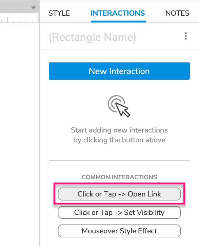
Select the Home button and click Click or tap → Open link in the Interactions pane.
-
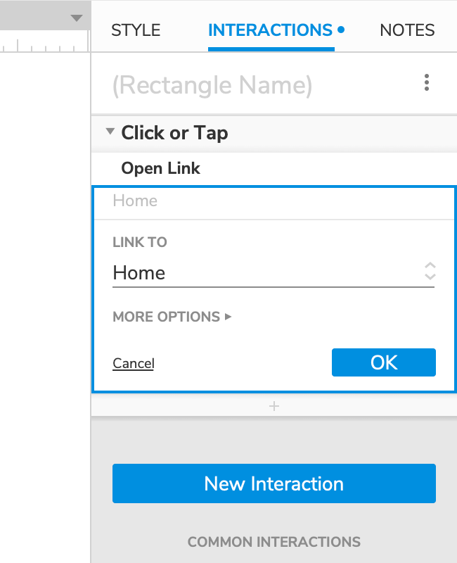
In the list that appears, select Home. Then, click OK to save the action.
-
Repeat these steps for the other three buttons, selecting the corresponding page for each button.
You could alternatively use the reference page feature to link the navigation buttons to the pages.
3. Create a component and add it to the other pages
-
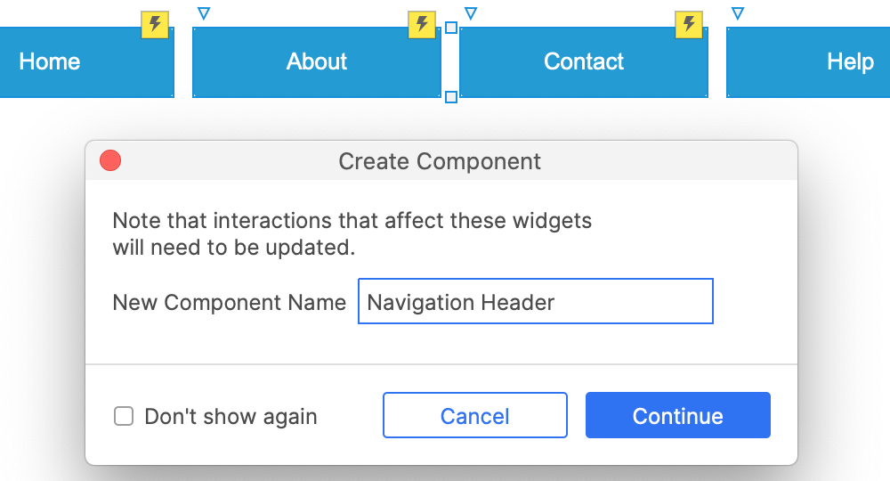
Select all four buttons and right-click the selection. In the context menu, select Create component.
-
In the dialog that appears, name the component Navigation header and click Continue.
-
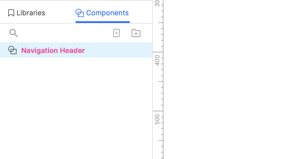
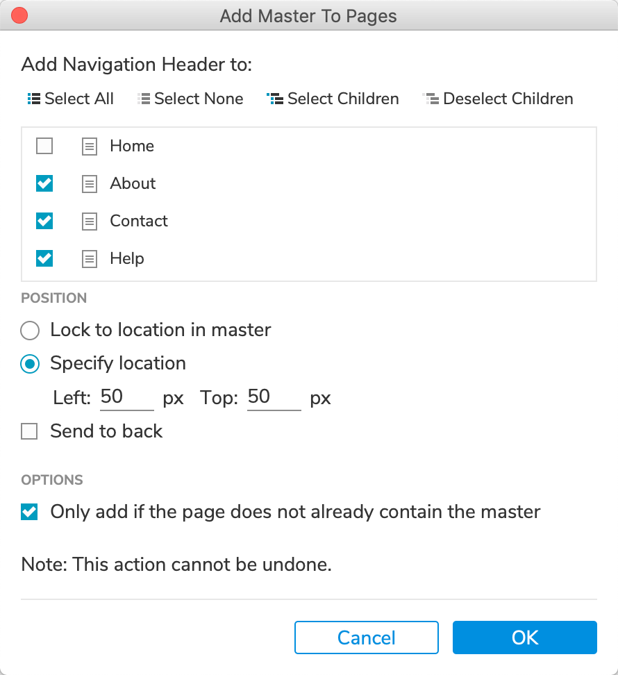
The new component should now be listed in the Components pane. Right-click it and select Add to pages.
-
In the dialog that appears, check the About, Contact, and Help pages since the component is not yet on those pages.
-
Under Position, specify the page coordinates you would like the component to be placed at. Then, click OK.
Any changes you make to the widgets inside the component will be reflected on all pages the component appears on.
4. Preview
Preview the page and click the navigation buttons to move between the prototype's pages.
5. Indicate the current page
Give the buttons a selected style effect
-
Double-click the Navigation Header component to open it on the canvas.
-
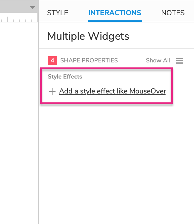
Select all four buttons and click Add a style effect in the Interactions pane.
-
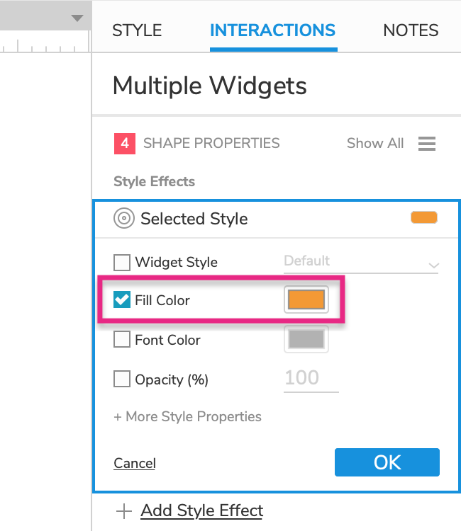
Click the Selected style effect and choose an orange fill color in the block that appears.
Set each button to its selected state when its matching page loads
-
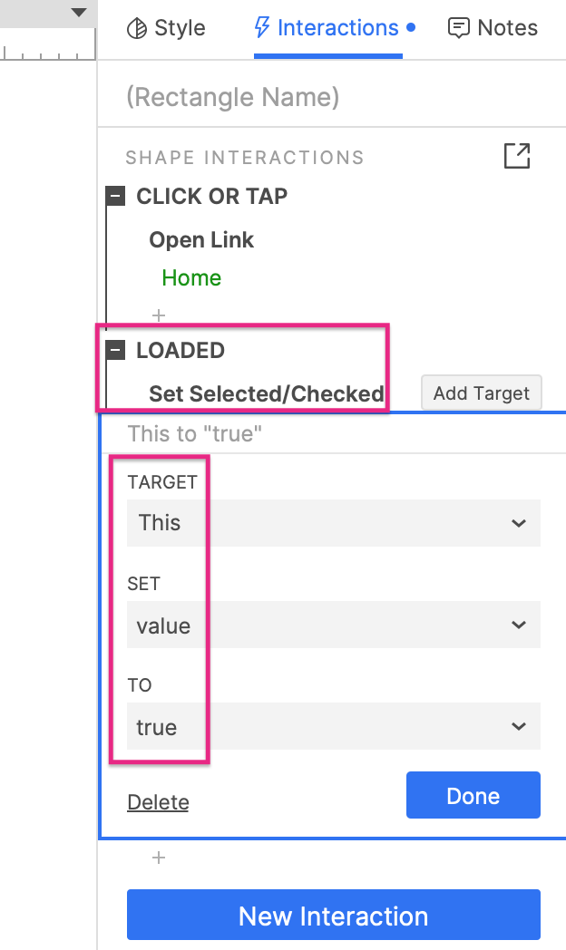
Select the Home button and click New Interaction in the Interactions pane.
-
Select the Loaded event and then the Set Selected/Checked action.
-
Select This Widget in the Target dropdown and leave the other values as they are.
-
Click Done to save the interaction.
-
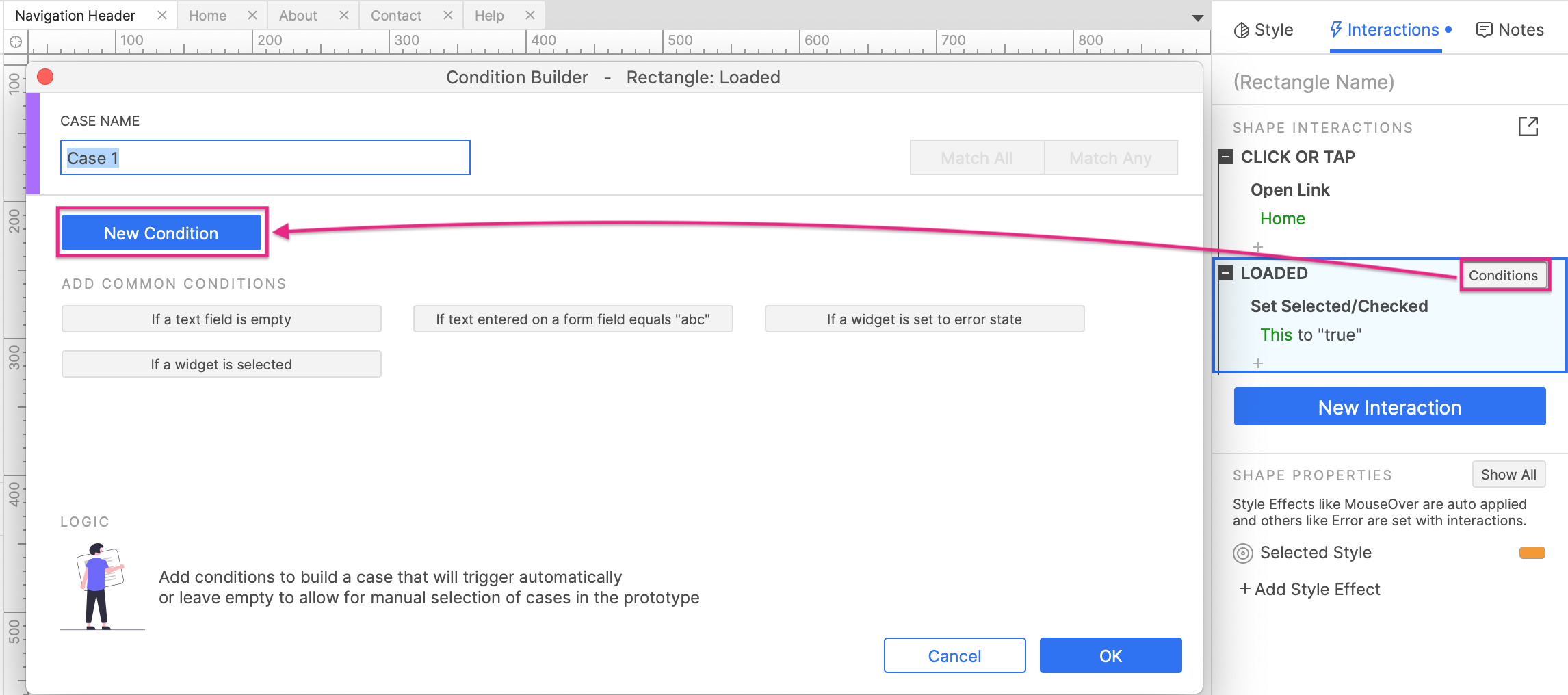
Hover your mouse cursor over the Loaded event heading and click Conditions to the right. In the Condition Builder dialog that appears, click New Condition.
-
In the condition row that appears, select text value in the first dropdown and enter
[[PageName]]in the field next to it. Leave the other fields as they are.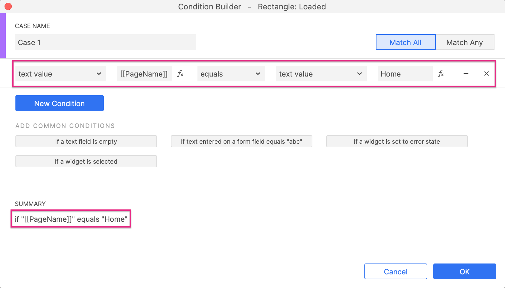
The summary at the bottom of the dialog should read:
if "[[PageName]]" equals "Home". This condition will be met if the Home page is the page loaded in the web browser. -
Click OK to close the Condition Builder.
-
Repeat these steps for the remaining three buttons.
6. Preview
Preview the page and click the navigation buttons to move between the prototype's pages. When each page loads, its corresponding navigation button should turn orange.
Additional information and tips
Sticky navigation
If you would like your navigation menu to be fixed in place, or "stuck", so that it doesn't move when the page is scrolled, place it inside a dynamic panel. Then, pin the dynamic panel to the browser. This technique is handy for making sticky headers, footers, and sidebars.
To learn how to make a scroll-activated sticky header, check out our tutorial for that here: Scroll-Activated Sticky Header tutorial.