Tab menu tutorial
In this tutorial, you'll learn how to make a structure in which clicking a tab reveals the contents of that tab.
1. Widget setup
Create the tab widgets

-
Open a new RP file and double-click Page 1 in the Pages pane to open it on the canvas.
-
Drag two button widgets onto the canvas from the Libraries pane.
-
Set the text of one button to
Tab 1and the other toTab 2.
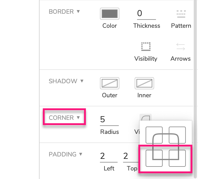
- Select both buttons and use the Corner visibility control in the Style pane to turn off the bottom corners. This will render both buttons with rounded corners on top and square corners on bottom (a tab shape).
Create the content widgets
-
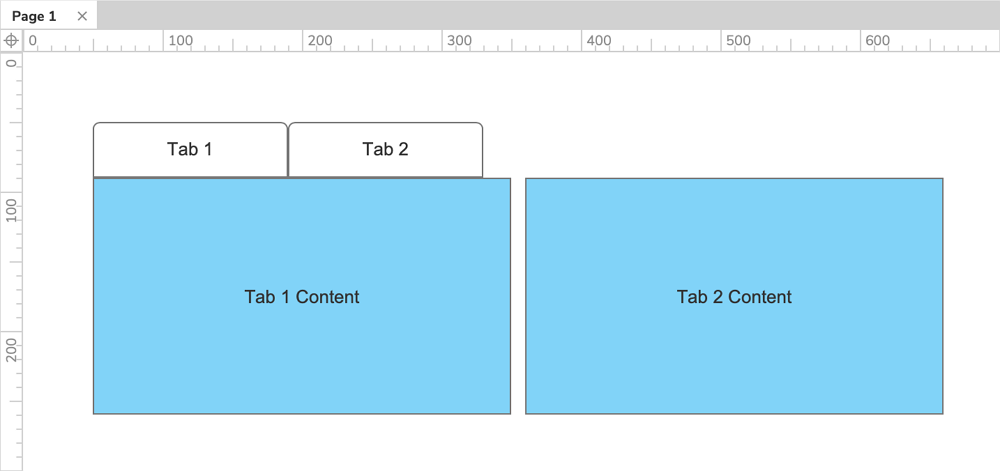
Drag a rectangle widget onto the canvas and place it below the two buttons.
-
Give the rectangle a blue fill color and set its text to
Tab 1 content. -
Drag a second rectangle onto the canvas and place it off to the right of the other widgets.
-
Give the second rectangle the same blue fill color as the first and set its text to
Tab 2 content.
2. Place the content rectangles in a two-state dynamic panel
-
Right-click the Tab 1 content rectangle and select Create dynamic panel in the context menu.
-
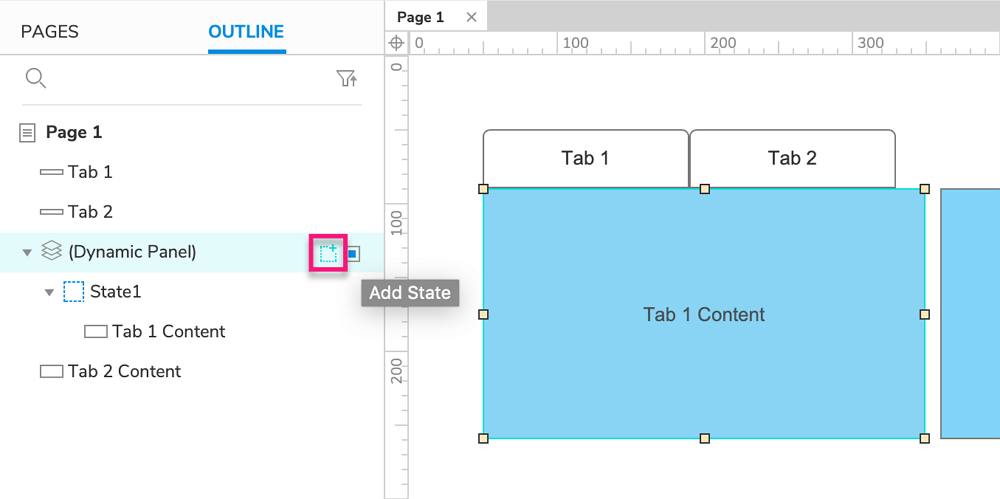
In the Outline pane, hover your cursor over the new dynamic panel widget's item and click the Add state icon to the right.
-
Still in the Outline pane, select the Tab 2 content rectangle and drag it under and to the right of State 2. This will add it to that dynamic panel state and open the state on the canvas.
-
Move the Tab 2 content rectangle to (0,0) on the canvas.
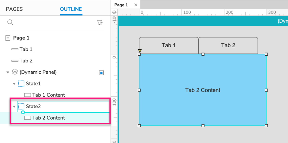
- Click Close at the top-right of the canvas or press ESC to exit state-editing mode.
When creating your own tab controls, you can include any widgets you'd like in each of the dynamic panel's states.
3. Set the dynamic panel's state when the tabs are clicked
-
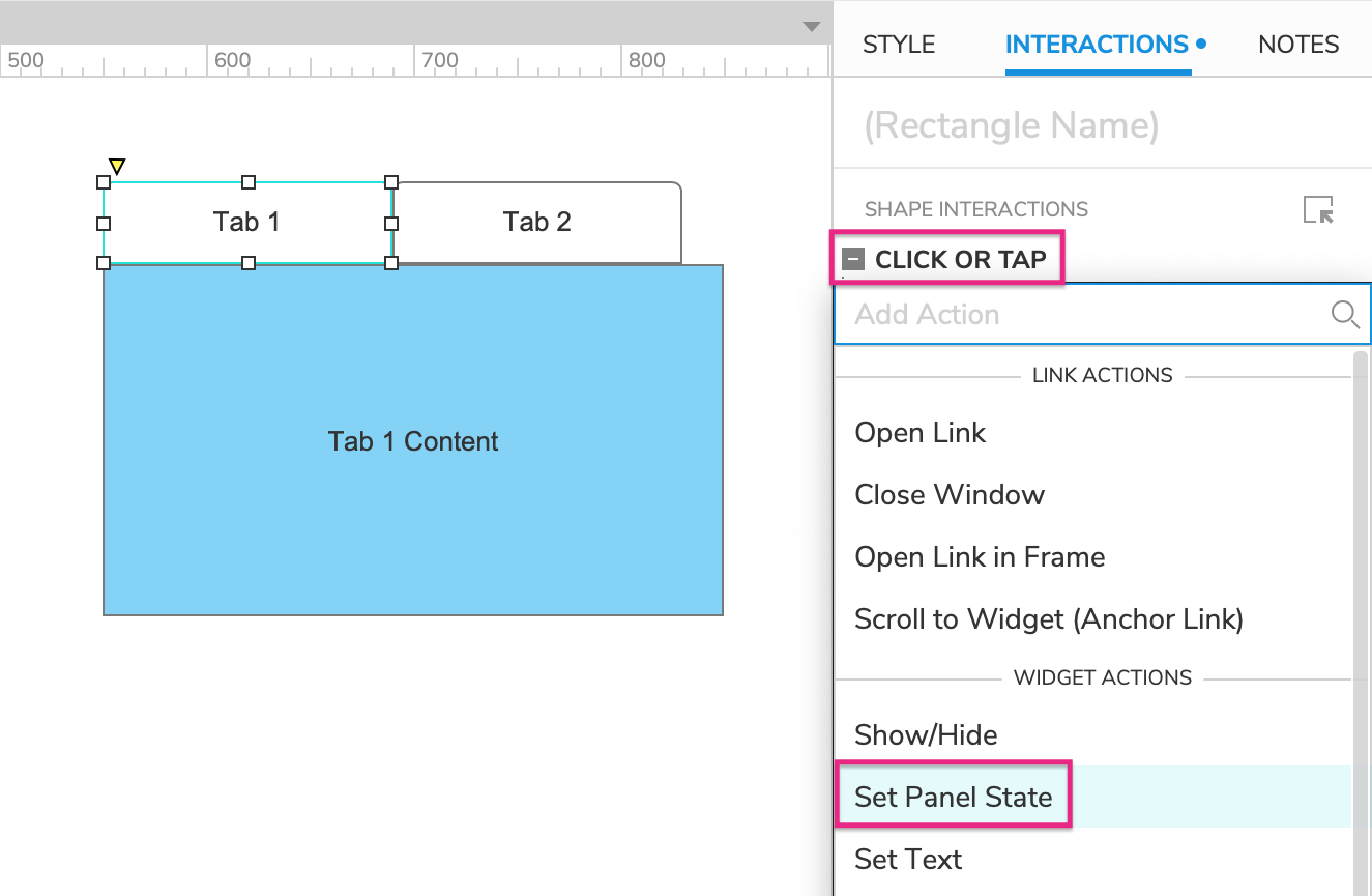
Select the Tab 1 widget and click New interaction in the Interactions pane.
-
Select the Click or Tap event in the list that appears, and then select the Set panel state action.
-
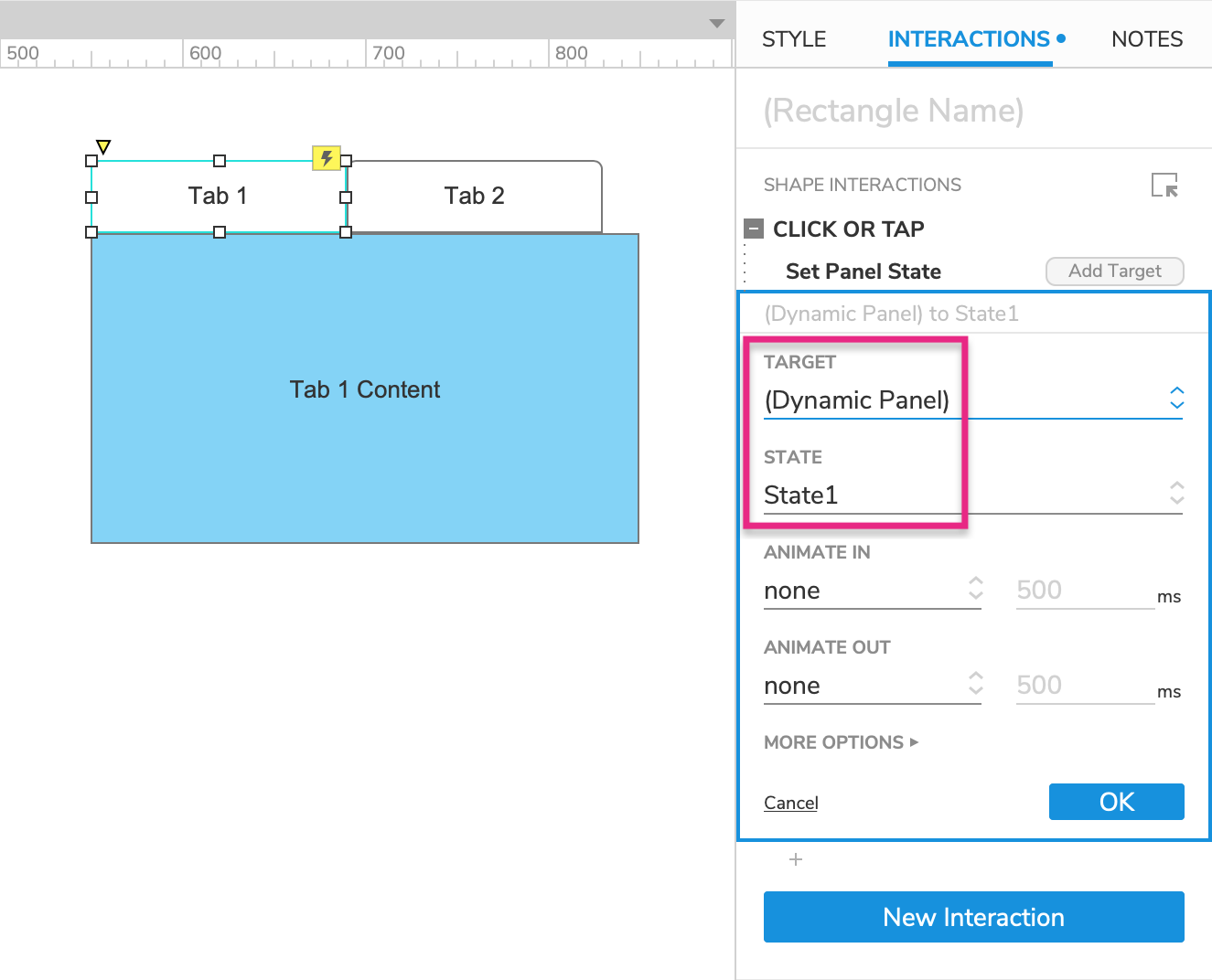
Select the dynamic panel in the Target dropdown, and select State 1 in the State dropdown.
-
Click OK to save the action.
-
Repeat these steps with the Tab 2 widget, setting the dynamic panel's state to State 2.
4. Indicate which tab is active
Give the tabs a selected style effect
-
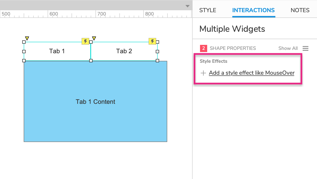
Select both tab widgets and click Add a style effect in the Interactions pane.
-
Choose Selected style in the list.
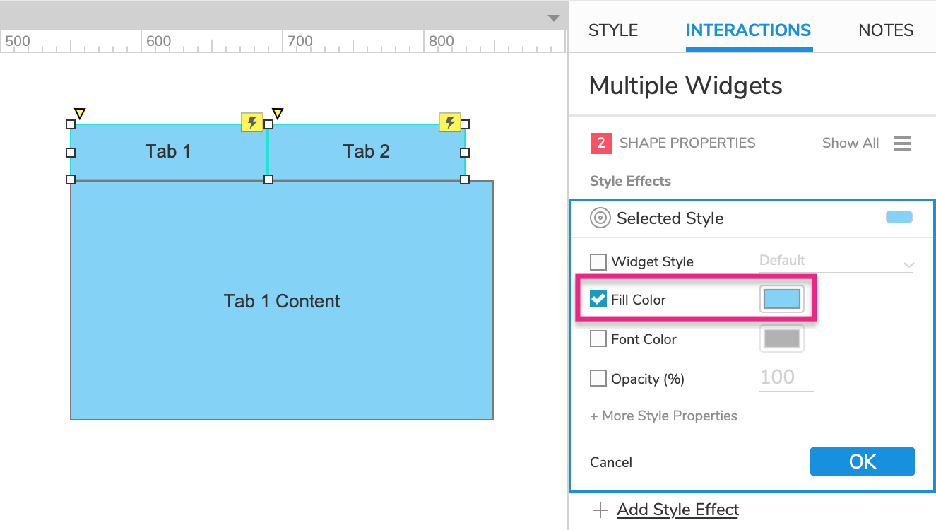
- In the block that appears, check the Fill Color property and select the same blue color that we used for the content rectangles.
Set the tabs to their selected state when clicked
-
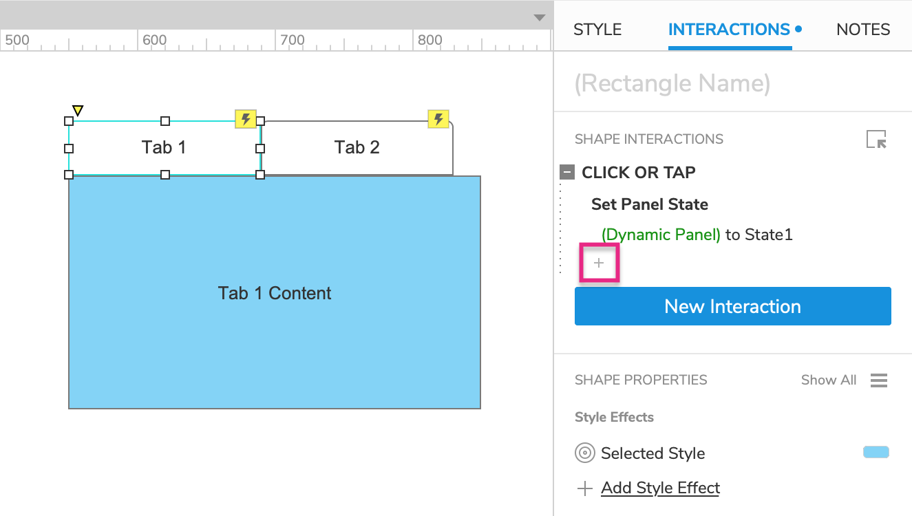
Select the Tab 1 widget and click the + symbol at the bottom of the Click or tap block in the Interactions pane.
This will let us add a new action to the event.
-
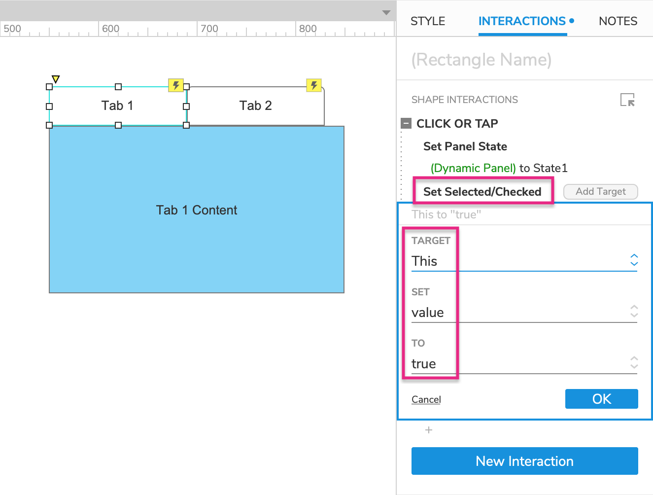
Select the Set Selected/checked action and target This widget.
-
Click OK to save the action.
-
Repeat this for the Tab 2 widget.
Put the tabs in a selection group
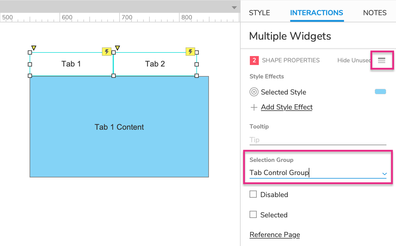
Putting the tab widgets in a selection group will ensure that only one of them can be in its selected state at a time.
-
Select both tab widgets and click the Show all icon at the top-right of the Interactions pane.
-
Enter
Tab Control Groupin the Selection group field.
Make tab 1 selected by default
-
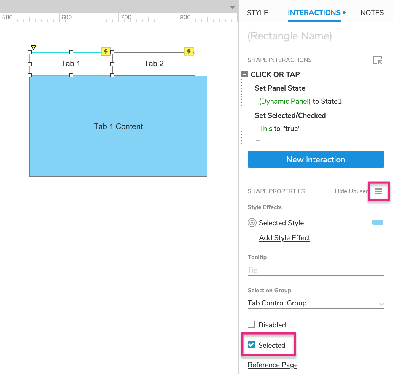
Select Tab 1 and click the Show all icon in the Interactions pane.
-
Check the box for Selected.
5. Preview the interaction
Preview the page and click the tabs to view their associated content.