Hiding and showing widgets tutorial
In this tutorial, you'll learn how to dynamically show and hide widgets in the web browser.
1. Widget setup
-
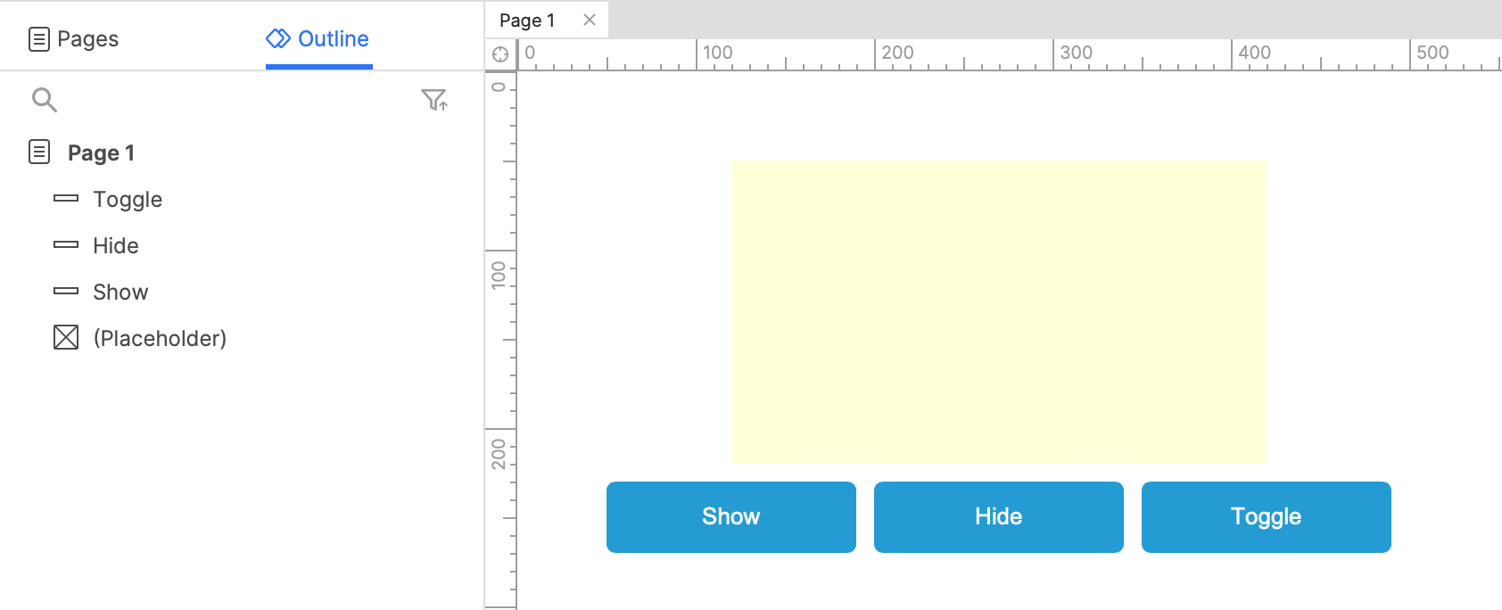
Open a new RP file and double-click Page 1 in the Pages pane to open it on the canvas.
-
Drag a placeholder widget and three button widgets onto the canvas from the Libraries pane.
-
Change the text on the buttons to
Show,Hide, andToggle.
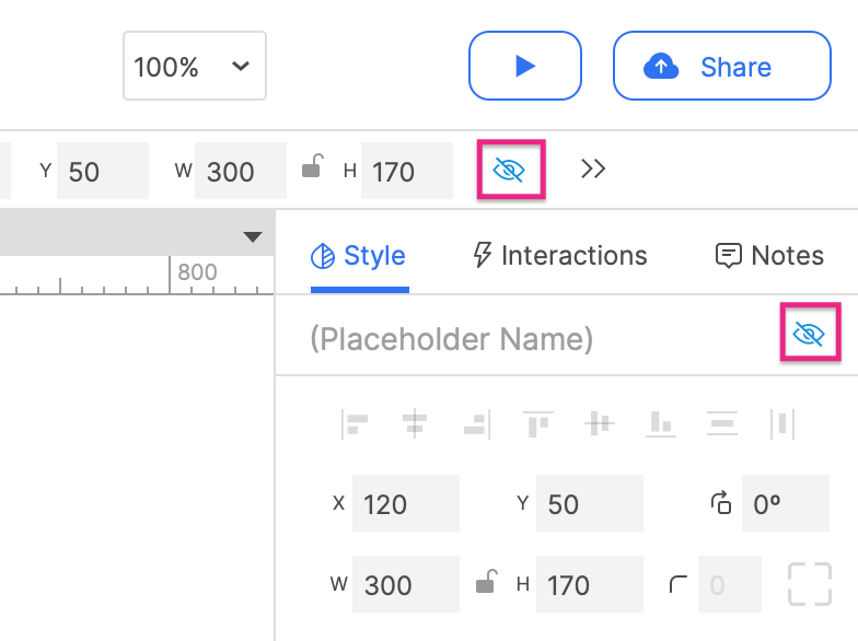
- Hide the placeholder by selecting it and clicking the Hidden icon in the style toolbar or the Style pane.
2. Setting the placeholder's visibility when the buttons are clicked
The show button
-
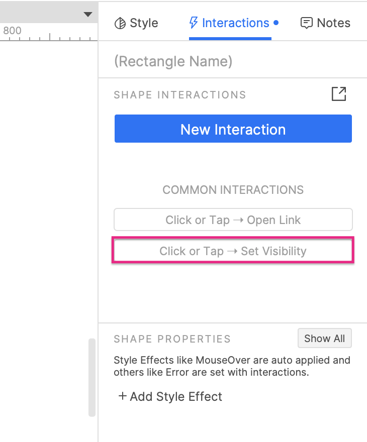
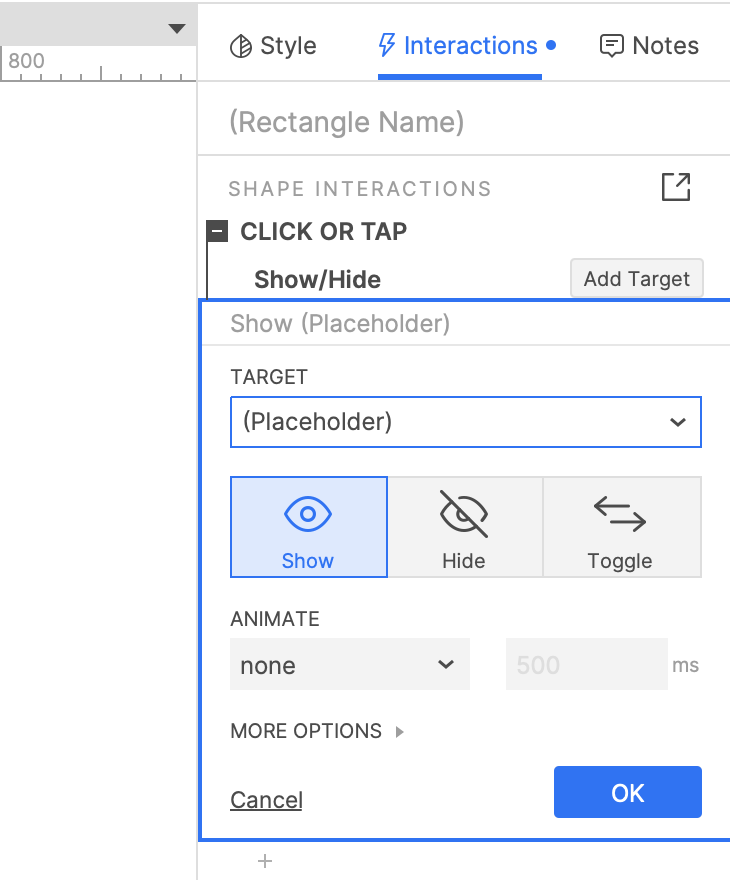
Select the Show button and click Click or Tap → Set visibility in the Interactions pane.
-
Select the placeholder widget in the dropdown that appears.
-
Leave Show selected and click OK to save the action.
The hide button
- Repeat the steps above with the Hide button, but select Hide instead of Show.
The toggle button
- Repeat the steps above with the Toggle button, but select Toggle instead of Show.
3. Preview the interaction
-
Preview the page and click the Show button to show the hidden placeholder.
-
Click the Hide button to hide the placeholder again.
-
Click the Toggle button a few times to alternately show and hide the placeholder.
Additional information and tips
Animations
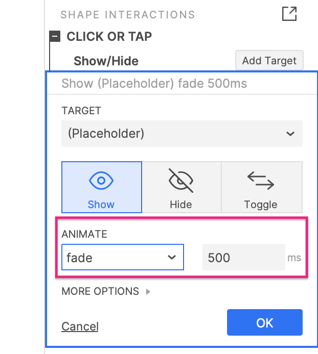
You can use a number of animations when showing and hiding widgets, including fading, sliding, and flipping. These are available in the Animate dropdown in the Show/hide action. Select the type of animation in the dropdown and set the duration of the animation (in milliseconds) in the field next to it.
Bring to front
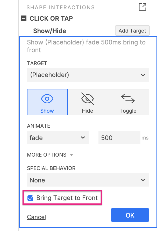
When showing a widget with either the Show or Toggle options, you can check the Bring to Front checkbox under More Options to have the widget automatically brought to the front of the design. This will ensure that no widgets overlap it when it is shown.
Lightboxes
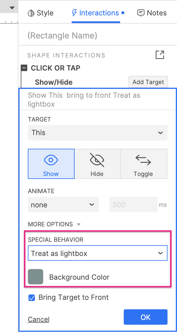
When showing a widget with the Show option, you can choose to have it appear as a lightbox. This option is available in the dropdown under More options at the bottom of the Show/hide action.
Lightboxed widgets appear with a colored mask behind them that covers the rest of the design. Clicking anywhere on this mask will hide the widget again. You can change the mask's color and opacity with the Background color color picker that appears when the Treat as lightbox option is selected.
Flyout menus
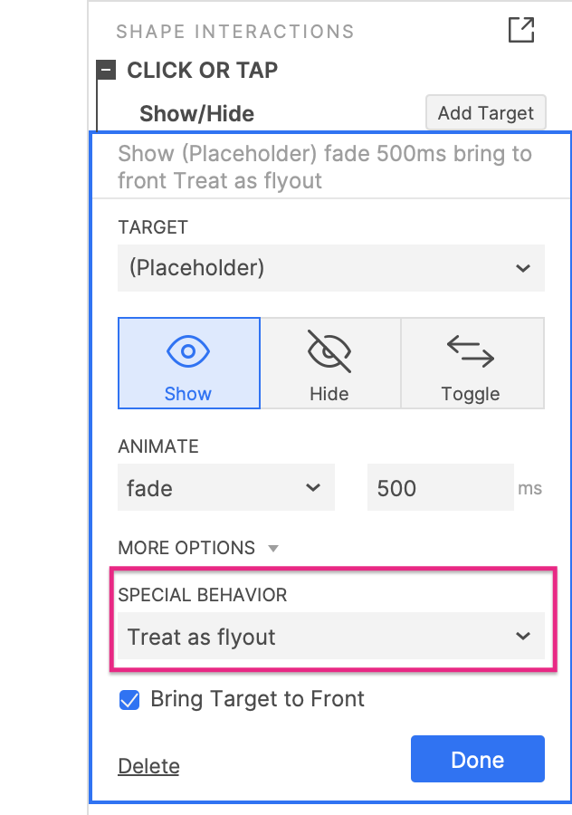
When showing a widget with the Show option, you can choose to have it treated as a flyout. A flyout widget is visible as long as the cursor remains on top of it or the widget that showed it. As soon as the cursor leaves the area of the widgets, the flyout widget is automatically hidden again.
For example, you might see flyout behavior when viewing the submenu items of a navigation menu or when viewing a tooltip for a page element.
This option is available in the dropdown under More options at the bottom of the Show/hide action.
Push/pull widgets
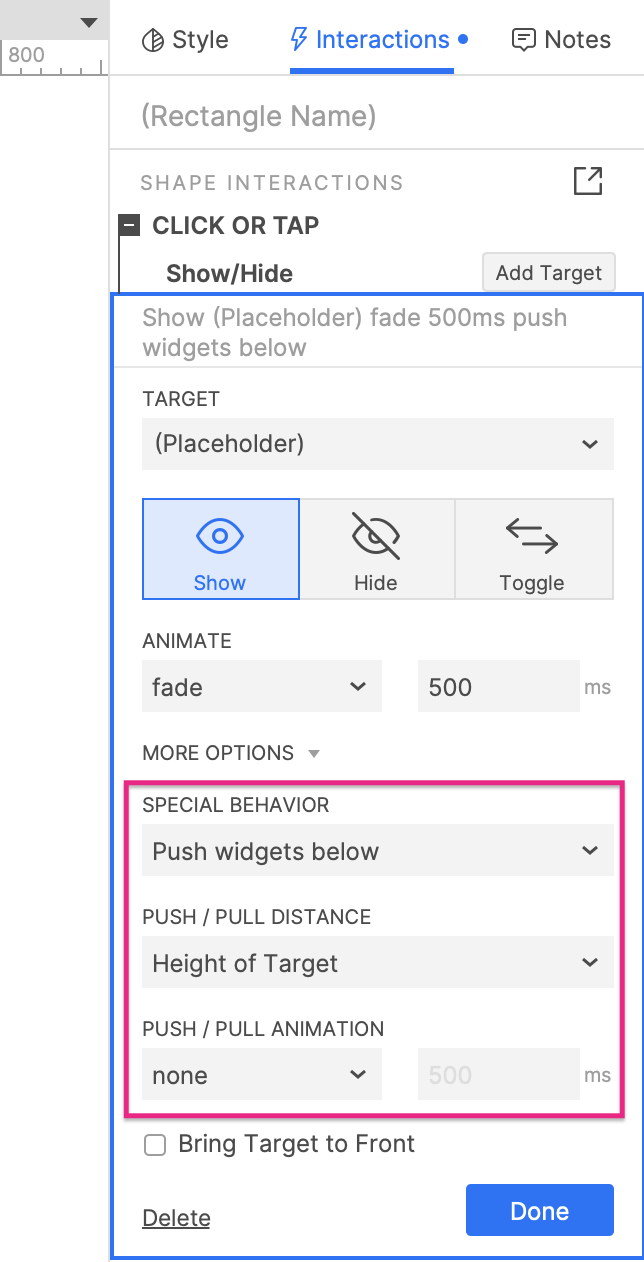
When showing a widget, you can choose to have other widgets on the page "pushed" down or to the right to make room for the shown widget. When hiding a widget, you can choose to have other widgets on the page "pulled" up or to the left to fill in the blank space left by the hidden widget.
These options are available in the dropdown under More options at the bottom of the Show/hide action.
