Accordion menu tutorial
In this tutorial, you'll learn how to make a structure in which clicking a heading expands a content area beneath it.
1. Widget setup
Create the first accordion item's heading
-
Open a new RP file and double-click Page 1 in the Pages pane to open it on the canvas.
-
Drag a Box 3 widget onto the canvas from the Libraries pane.
-
Set the box's height to
50with the H field in the Style pane or the style toolbar. -
Set the box's text to
Heading 1.
Create the first accordion item's content
-
Drag a Box 2 widget onto the canvas and place it directly below the Heading 1 box.
-
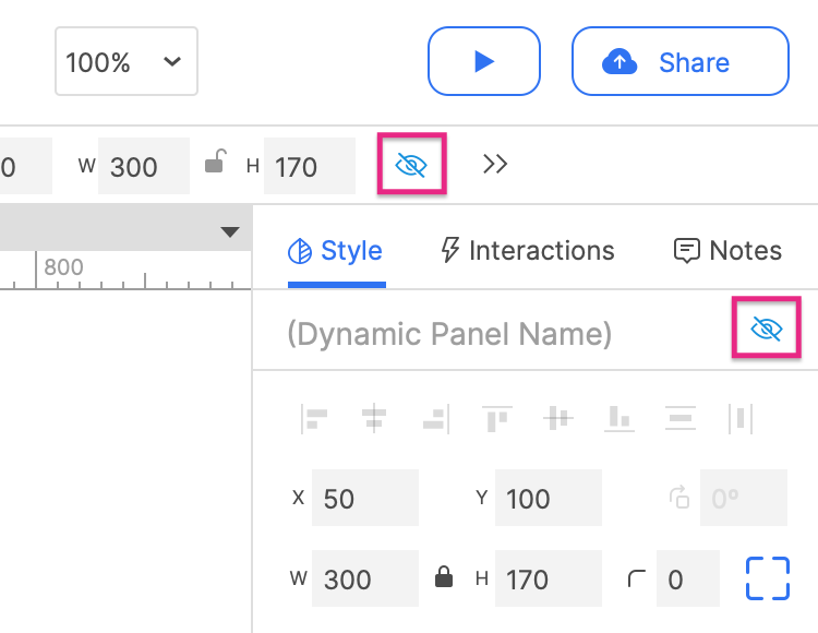
Right-click the box and select Fill with Lorem Ipsum in the context menu to fill the box with text.
- Hide the Lorem Ipsum rectangle by selecting it and clicking the Hidden icon in the Style pane or the style toolbar.
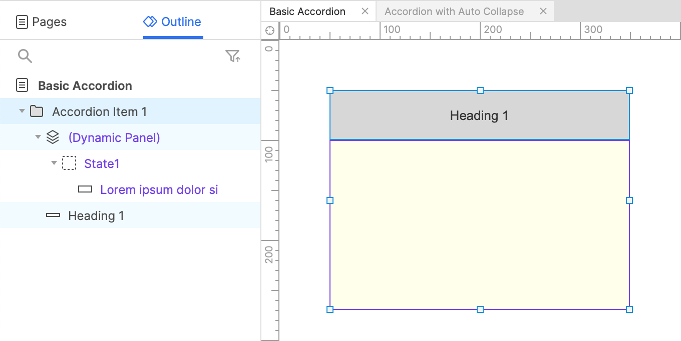
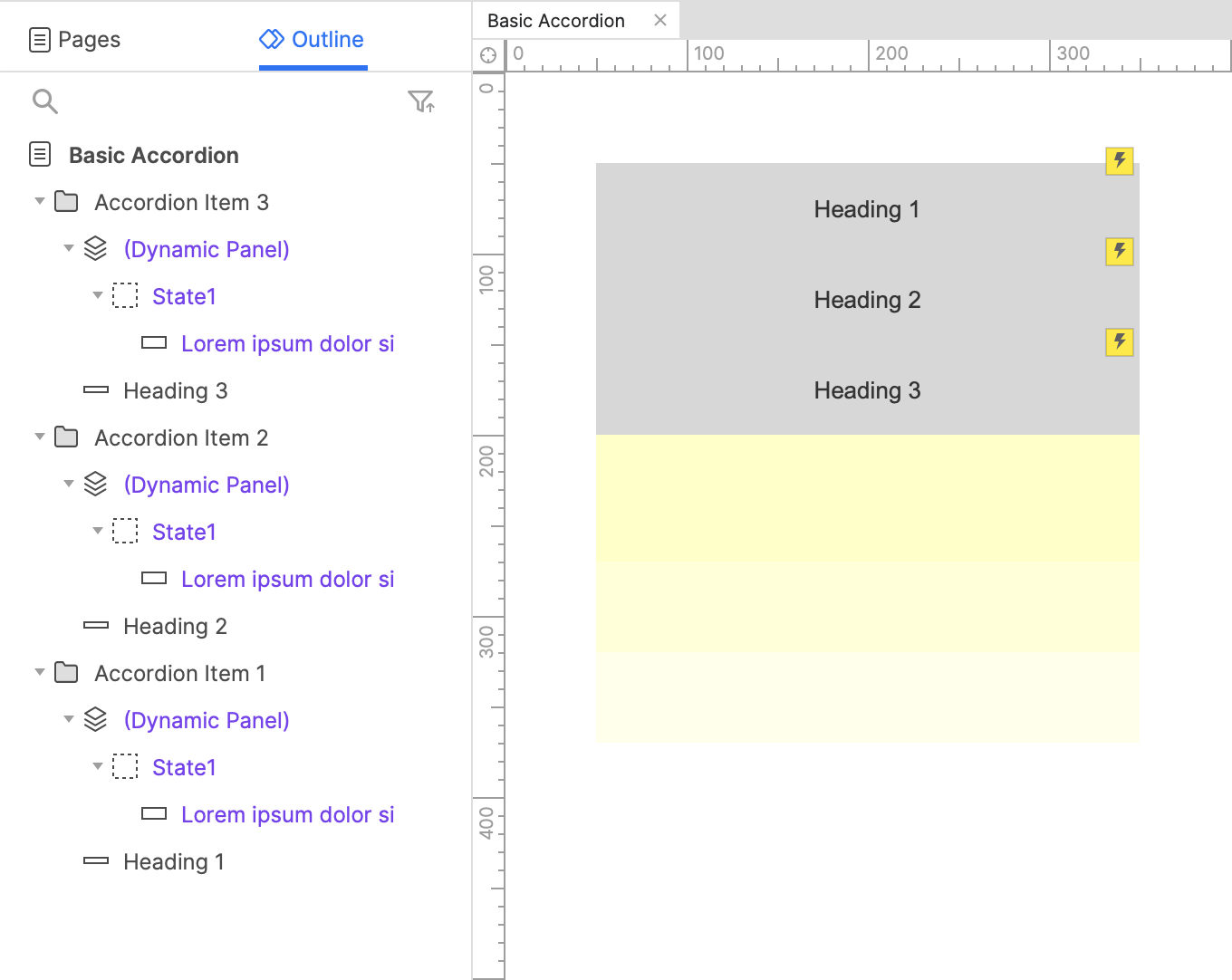
Group the heading and content widgets
-
Select the Heading 1 box and the Lorem Ipsum rectangle and click Group at the top of the interface to place them in a widget group.
-
Name the group
Accordion Item 1.
2. Toggle the content's visibility when the heading is clicked
-
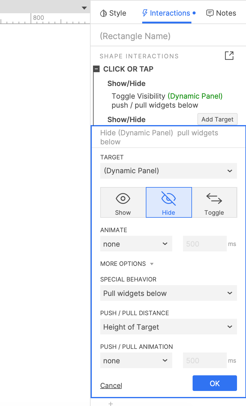
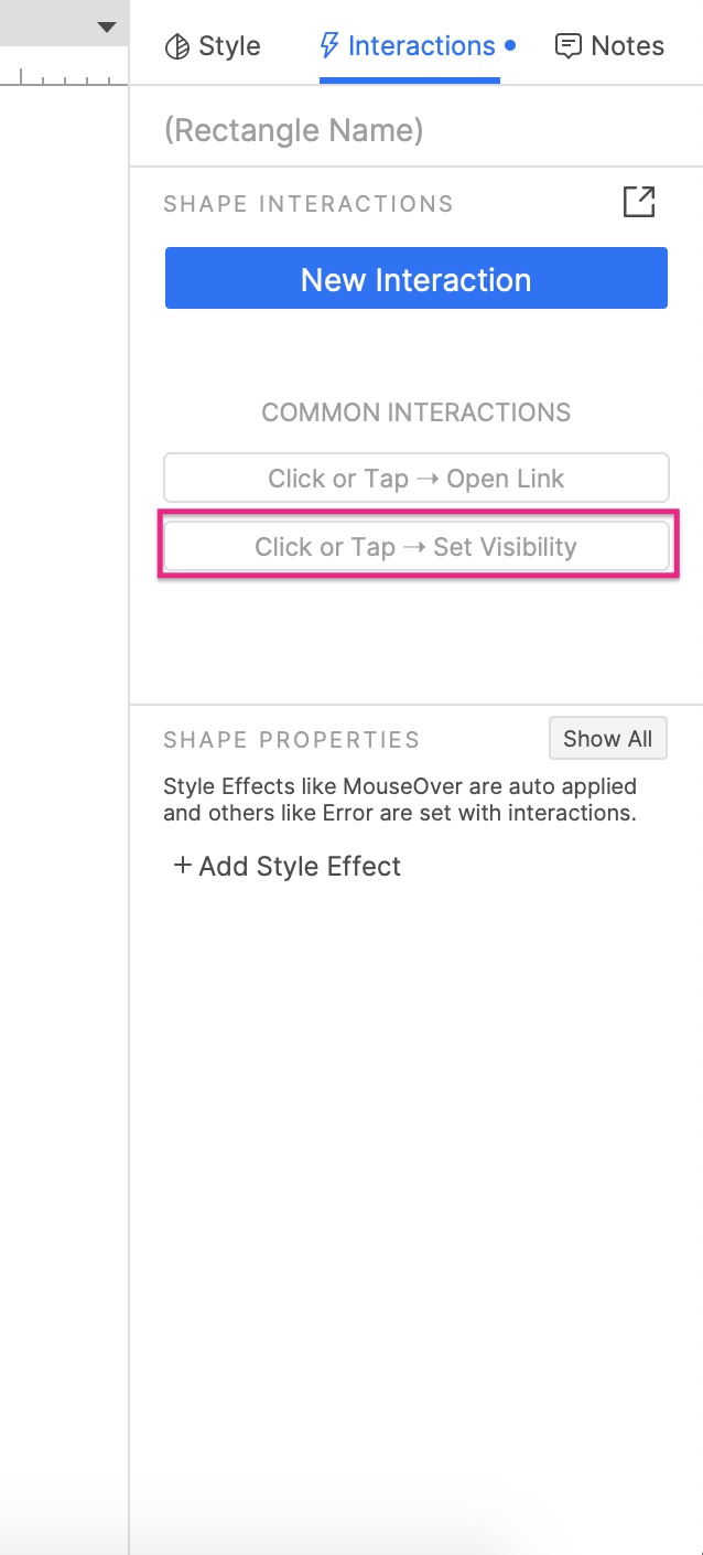
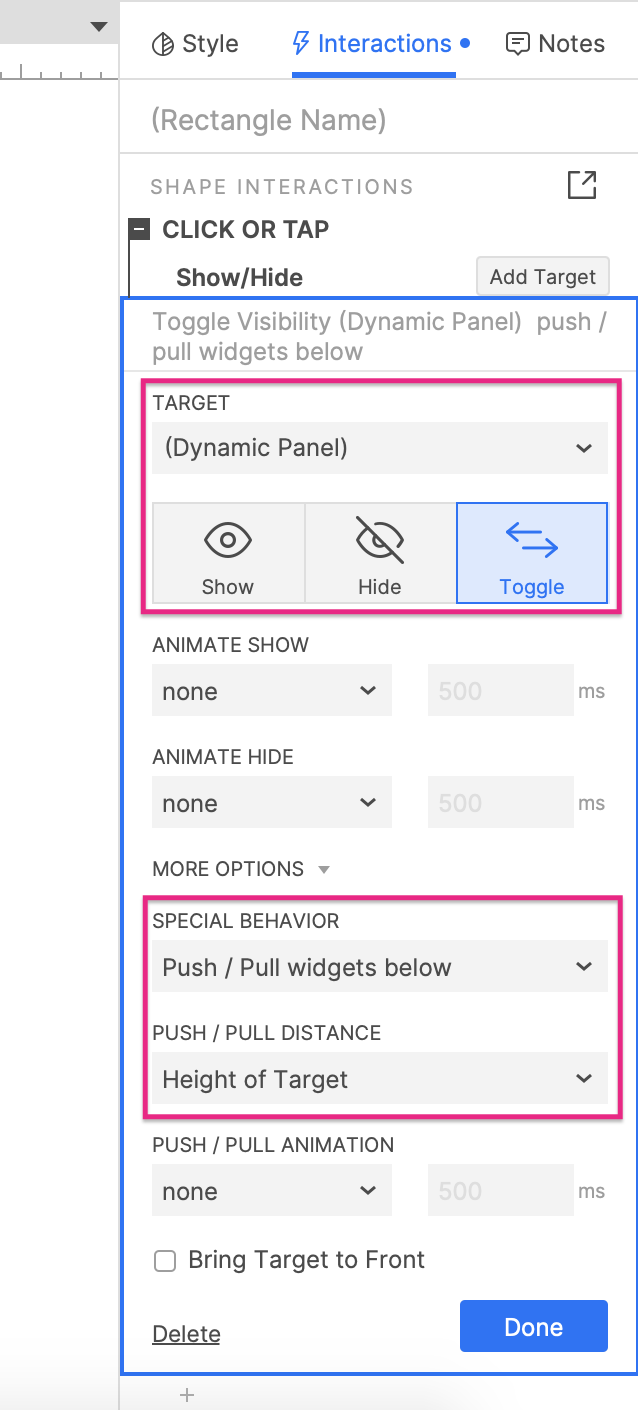
Select the Heading 1 box and click Click or tap → Set visibility in the Interactions pane.
-
Select the dynamic panel in the Target dropdown, and then select Toggle just beneath it.
-
Click More Options at the bottom of the action settings and select Push/pull Widgets in the dropdown that appears.
-
Leave the Below radio button selected and click OK to save the action.
3. Duplicate the group to create more accordion items
Create a second item
-
Right-click the Accordion Item 1 widget group and select Copy. Then, right-click an empty spot on the canvas and select Paste.
-
Rename the new widget group
Accordion Item 2and set the text on its heading box toHeading 2. -
Position the Accordion Item 2 group so that the Heading 2 box is just below the Heading 1 box.
Create a third item
- Repeat these steps to create a third widget group. Name the group
Accordion Item 3and set its heading box's text toHeading 3. Place it below the Heading 2 box.
4. Preview the interaction
Preview the page and click the accordion headings to expand and collapse their corresponding content dynamic panels.
Additional information and tips
Collapse open items when a new item is expanded
If you'd like only one accordion item to be expanded at a time, add another Show/hide action to each heading box's Click or tap event that hides every rectangle other than its own. For example, the Heading 1 box would hide the rectangles in the Accordion Item 2 and Accordion Item 3 groups.
Note
Don't forget to select the Pull widgets option when hiding the Lorem Ipsum rectangles!