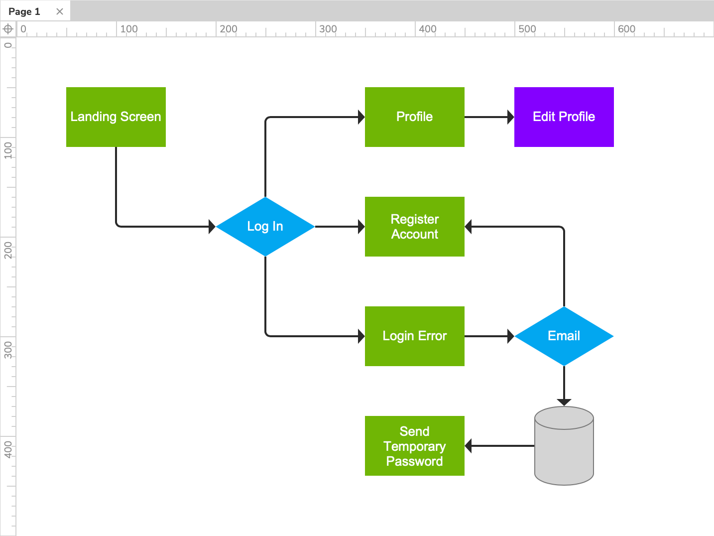
Connectors
Connectors are special widgets that are used to connect shape, image, and snapshot widgets in a flow diagram. Each end of a connector anchors to a connector point on a target widget, and the connectors automatically reflow to stay connected when you move the target widgets on the canvas.
Connecting widgets
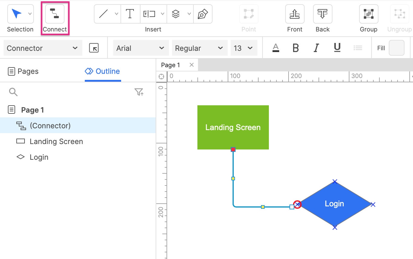
To draw a connector between two widgets, click the Connect icon at the top-left of the UI to put the canvas into connector mode. While in connector mode, you can hover over a widget to view its connector points. Click-and-drag from a connector point on one widget to a point on another widget to draw a connector between them.
Editing connector points
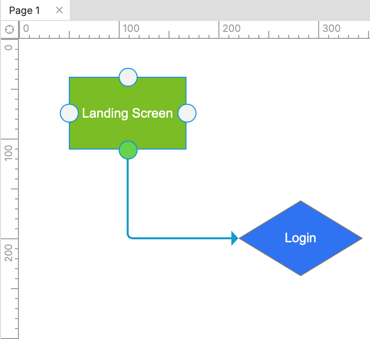
Shape, image, and snapshot widgets have four connector points by default, one on each of the widget's sides. You can add more points, delete points, and reposition points as you wish. To do so, right-click a widget and select Transform Shape → Edit Connector Points.
To add a connector point, click anywhere on the widget. Right-click a connector point to delete it, or select it and press DELETE. To move an existing connector point somewhere else, drag it (this will also move any connector widgets attached to the point).
Routing connectors
Changing routing
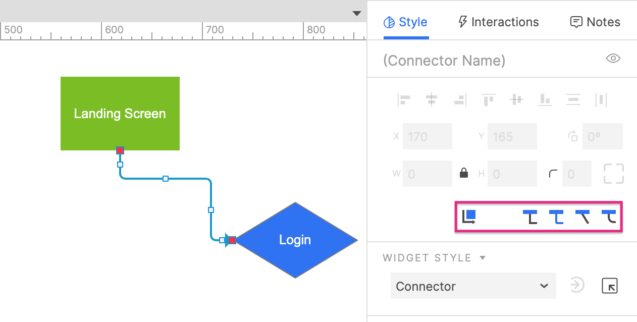
By default, connectors follow the shortest path between the two points they're anchored to. You can manually change the routing of a connector, however, by selecting it and dragging any of the handles along its path to reposition that portion of the connector.
To revert a connector back to its default routing, select it and click the Reflow icon in the Location and size section of the Style pane.
Changing the route type
You can change a connector's route type by selecting it and clicking one of the following options in the Location and size section of the Style pane:
- Sharp turns (default)
- Rounded turns
- Straight
- Curve
Line styles and arrowheads
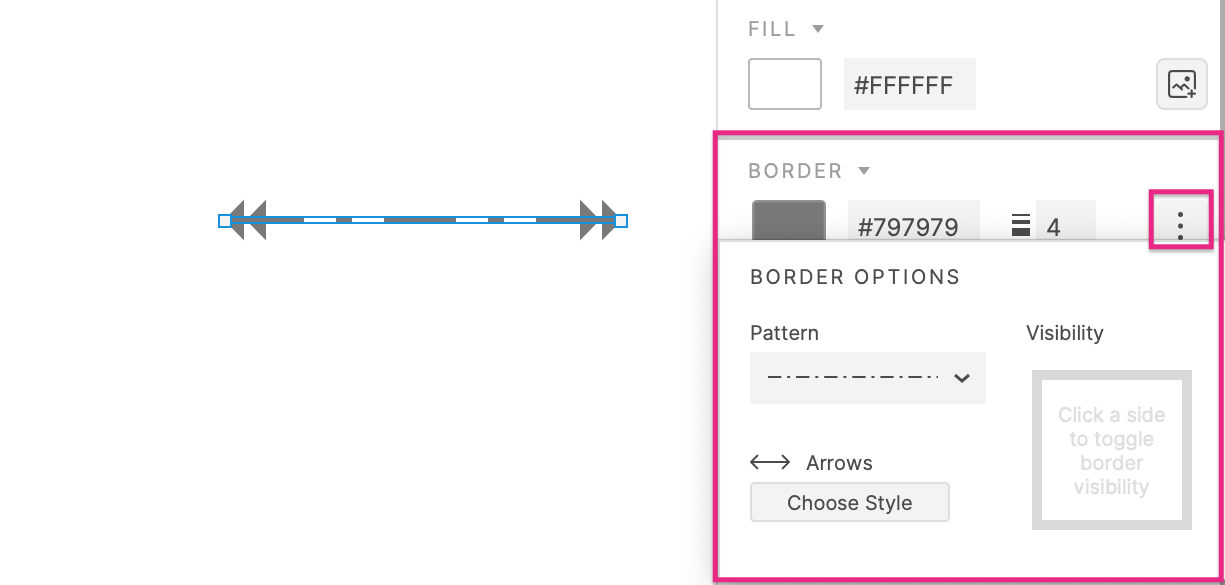
Connectors can be styled with the following Border properties in the Style pane:
- Color
- Thickness
- Pattern
- Arrows
Adding and editing text
You can add text to a connector widget or edit its current text via any of the options below:
- Double-click the connector to enter text-editing mode
- Select the connector and press ENTER to enter text-editing mode
- Select the connector and begin typing. (This option is only available if you have disabled the single-key shortcuts)