The grid, guides, and snapping
The Axure RP canvas includes a number of features to help you lay out your diagrams. You can display and customize a background grid as well as vertical and horizontal guides that can be page-specific or globally applied to all pages in the project. You can use these as simple visual guides or have your widgets automatically snap to them and to each other.
The grid and guides are only visible in Axure RP; they will not appear when you view your pages in the web browser.
The grid
You can show a grid of dots or lines on the canvas by going to View → Rulers, grid, and guides and checking Show grid.
Whether the grid is visible or not, widgets will snap to it when you move or resize them via dragging. You can disable this behavior by unchecking Snap to grid under View → Rulers, grid, and guides.
By default, the grid is 10px by 10px and is drawn as dots. If desired, you can set a custom interval, switch to lines instead of dots, and change the color of the grid with the options in the Arrange → Rulers, grid, and guides → Grid settings dialog.
Guides
guides are lines added to the canvas that help mark where widgets should be placed. You can toggle the visibility of the various types of guides at View → Rulers, grid, and guides.
Page and global guides
Page guides appear on a single page or component in the project. To add a page guide to the canvas, click-and-drag from one of the rulers and drop the guide at your desired X or Y value. Page guides are teal by default.
Global guides are similar to page guides, but they're always visible on the canvas, regardless of which page or component you're currently working on. To create a global guide, hold CTRL or CMD as you drag from the ruler. Global guides are magenta by default.
Deleting page and global guides
To delete a page guide or global guide, right-click it and select Delete. Alternatively, you can select a guide or group of guides and press DELETE on your keyboard.
To delete all the guides on a page at once, go to View → Rulers, grid, and guides → Delete all guides.
Deleting a global guide from one page also removes it from every other page in the project.
The create guides dialog
You can create a series of page or global guides all at once with the View → Rulers, grid, and guides → Create guides dialog. You can specify your own values for each of the fields or select from four presets in the dropdown at the top of the dialog:
- 960 Grid: 12 Column
- 960 Grid: 16 Column
- 1200 Grid: 12 Column
- 1200 Grid: 15 Column

Lock guides
You can lock page and global guides so they cannot be moved or deleted. To lock one or more guides, select them, right-click, and choose Lock in the context menu. You can also lock all the guides in the project at once by checking View → Rulers, grid, and guides → Lock guides.
Page dimension guides

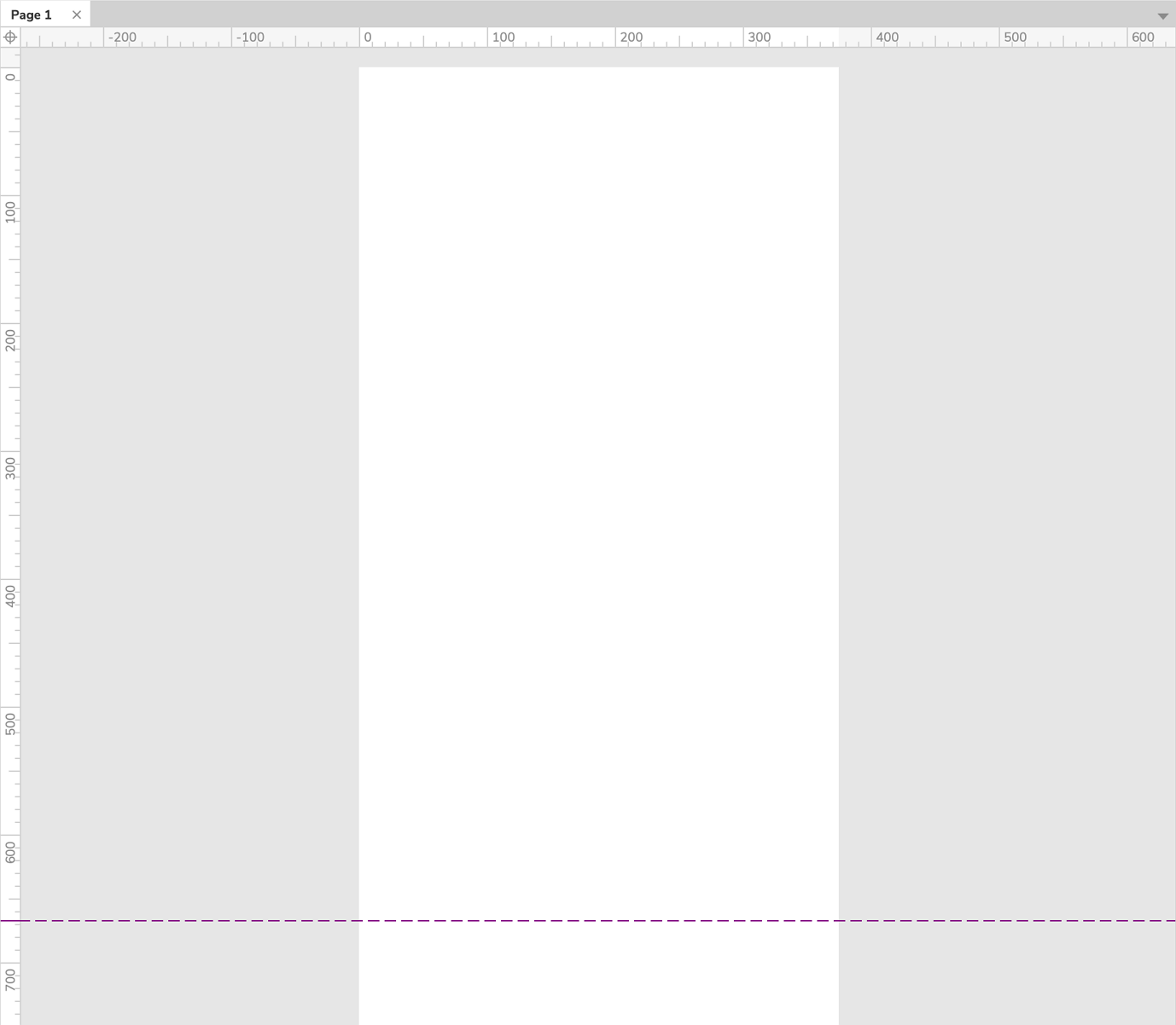
Page dimensions guides show the boundaries of pages for which you've defined page dimensions. The top, left, and right boundaries of the page are marked by the grey mask that appears around the viewport region of the canvas, and the bottom boundary is marked by a dashed, maroon line.
If you're using adaptive views on a page, the page dimensions guides will automatically update when you switch between views.
Print guides
Print guides show the page boundaries of the currently selected print paper size—available at File → Paper size and settings—and they update automatically when you switch between paper sizes. Print guides are grey by default.
Snap to guides
When you drag a widget around on the canvas or drag to resize it, it will automatically snap to any nearby guides. If you'd like to disable this behavior, go to View → Rulers, grid, and guides, and uncheck Snap to guides.
Render guides in back
By default, guides are rendered in front of widgets on the canvas so that they're always visible. If you'd like them to be rendered behind widgets instead, open the View → Rulers, grid, and guides → Guide Settings dialog and check the box for Render guides in back.
Rulers
You can toggle the visibility of the rulers along the left and top edges of the canvas by going to View → Rulers, grid, and guides and checking or unchecking Show Rulers.
Snap to widgets
When you drag a widget around on the canvas or drag to resize it, its sides and midpoints will automatically snap to the sides and midpoints of nearby widgets. As this happens, red guides will appear to indicate what the widget is snapping to and what the relevant pixel distances are.
You can change the color of the widget snap guides and define margins for widgets to snap to — for example, snap when 25px away from a nearby widget — in the View → Rulers, grid, and guides → Widget snap settings dialog.
If you'd like to disable this behavior, go to View → Rulers, grid, and guides, and uncheck Snap to widgets.