Styling widgets
Style properties
You can edit the following properties to customize the visual style of your widgets. You can access these properties in the Style pane or in the style toolbar along the top of the canvas.
Opacity
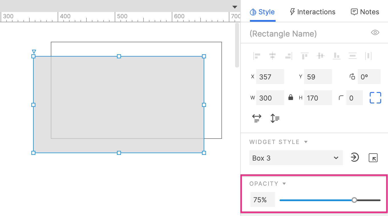
Use the slider or the numeric input field in this section to set the target widget's overall opacity. This value stacks with both the fill color and text color opacity values.
Typography
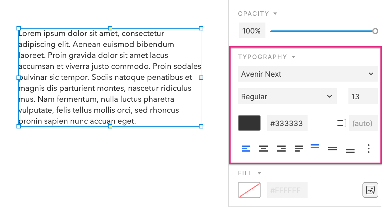
Font settings: These control the style of a widget's text by setting its font family, typeface, font size, and font color.
If you use fonts listed under the Local heading in the font picker, see the web fonts reference guide to learn how to preserve the fonts when you publish your prototype.
Line spacing (leading): Adjusts the amount of space between lines of text. You can set a specific pixel value or leave "auto" selected to use the default spacing.
Character spacing (tracking): Adjusts the amount of space between individual characters in widget text. You can set a specific value (in tenths of a pixel) or leave "0" selected to use the default spacing.
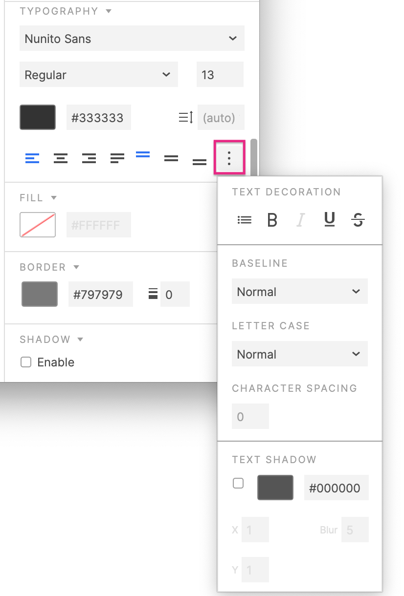
Additional text options: This menu includes the following formatting options:
-
Bulleted list, Bold, Italic, Underline, and Strikethrough
-
Baseline: Moves the baseline of the selected text up or down. Choose from Normal, Superscript, and Subscript.
-
Letter case: Transforms the case of all characters in the selected text. Choose from Normal, Uppercase, and Lowercase.
-
Text shadow: Adds a drop shadow to each character in the widget text.
-
Alignment: The seven alignment options control the alignment of a widget's text within its borders. You can control both horizontal and vertical alignment.
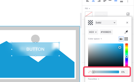
Fill
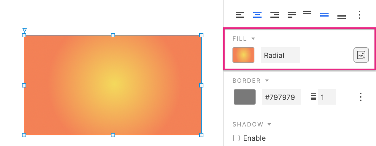
Color: Sets a widget's fill color. Widget fill colors can be solid or include a linear or radial gradient.
Image: Sets a shape widget's fill image and the image's alignment, scaling, and tiling.
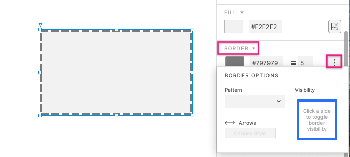
Border
Color: Sets the color and opacity of a line widget or a two-dimensional widget's outline. Line colors can be solid or include a linear or radial gradient.
Thickness: Sets the thickness of a line widget or a two-dimensional widget's outline.
Pattern: Sets the pattern of a widget's outline.
Visibility: Controls which sides of a rectangle widget display a border.
Arrows: Adds arrowheads to one or both ends of a line widget or an open shape.
Shadow
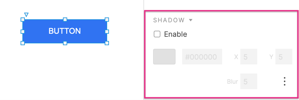
Give the selected widget an outer and/or inner shadow. You can control the shadow's X and Y offsets, its blur, and its color. For inner shadows, you can also control the shadow's spread.
Blur
Give the selected widget or widgets behind a blur effect. Widget blur will blur the selected widget and the blur intensity can be modified in the numeric field.
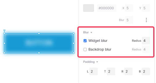
Backdrop blur will blur the widgets behind the selected widget and can be seen when adjusting the widget's Fill opacity to less than 100%.
Corner
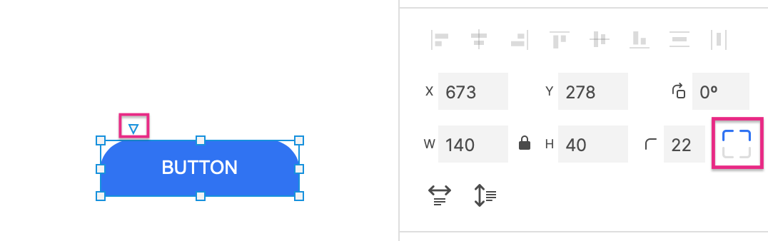
Use the numeric Radius field to round the corners of a rectangular widget. (You can also do this by selecting the widget on the canvas and dragging the triangle at its top-left corner.)
To control which of the corners display the rounding, toggle the Set Corner Radius icons.
Padding
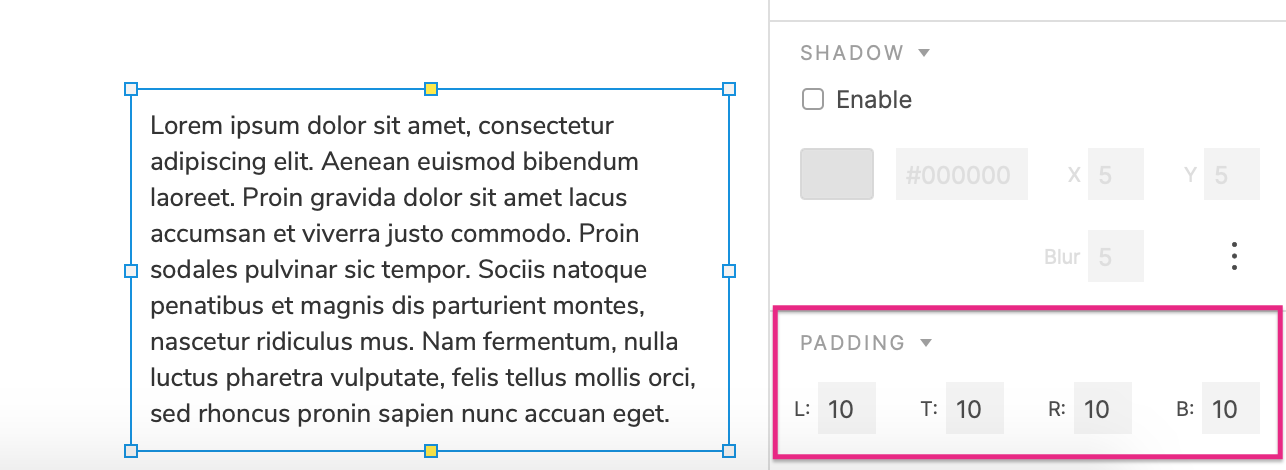
These numeric controls determine the minimum amount of space, in pixels, between a widget's text and the corresponding border, Left, Top, Right and Bottom.
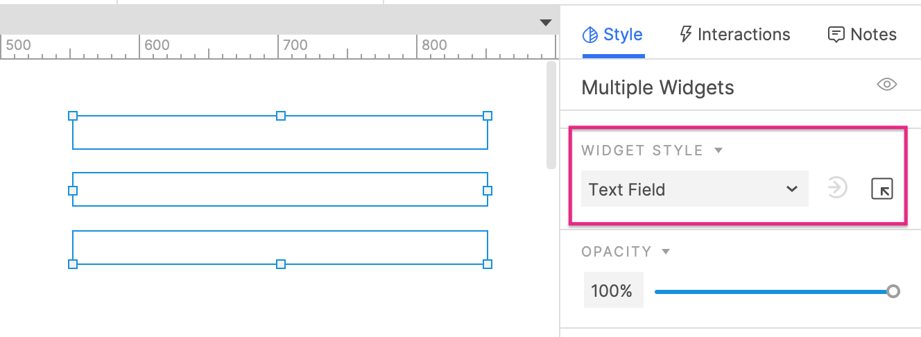
Widget styles
Widget styles are reusable, centrally managed sets of style properties. You can apply a single widget style to multiple widgets in order to unify their styling. If you change one of the property selections in the widget style, the change will be applied to all widgets using that style.
To apply a widget style to one or more widgets, select the widget(s) and then select the widget style in the widget style dropdown in the Style pane or the style toolbar.
You can view and manage the widget styles in a prototype by going to Project → Widget style manager or by clicking the Manage widget styles icon next to the widget style dropdown in the Style pane or the style toolbar.
Widget style hierarchy
Every widget's visual appearance is determined by style property selections made in the following locations, listed in order from highest to lowest priority:
-
Style property selections made on the widget itself in the Style pane or the style toolbar, which override the selections in both the Default style and the widget's own applied widget style.
-
The widget's applied widget style — for example, the Box 3 style — whose style property selections override the selections in the Default style.
-
The Default style at the top of the Widget style manager dialog, whose style property selections are applied to every widget in the prototype.
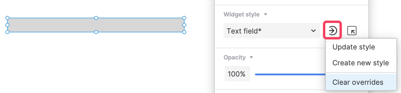
When a widget's style property selections differ from those of its widget style, the widget style name is followed by an asterisk in the Style pane and style toolbar. You can click the Update or create style icon and select Clear overrides to clear overriding style property selections and return to the applied widget style.
The widget style manager
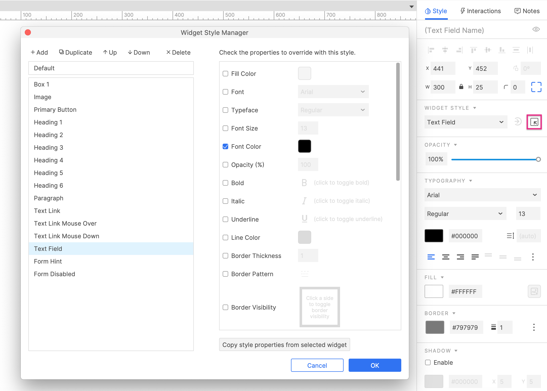
Click the Manage widget styles icon, next to the widget style dropdown in the Style pane or the style toolbar, to open the Widget style manager. You can also access this dialog via the Project → Widget style manager menu option.
To add a new style, click Add at the top of the dialog. Alternatively, you can click Duplicate to make a new style from an existing style.
To delete a style, select it and click Delete. Use the Up and Down arrows to reorganize the styles in the dialog.
To edit the style properties of a widget style, select it in the left column. In the right column, check the box next to a style property to have that property override the Default style, and then make your selection for the property in the applicable field.
You can also edit multiple styles at once. Hold CTRL or CMD while selecting styles in the left column and then make changes in the right column.
Styles in team projects
Styles in a team project can be edited without checking out the project styles. To update style changes for all users of the project, send changes via the Team → Send changes to team directory menu command.
Copy and paste styles
You can copy the styling of one widget and paste it onto another widget. To do so:
- Copy the first widget.
- Right-click the second widget.
- Select Paste special → Paste style.
The second widget will take on all the style properties of the first widget, including its applied widget style.
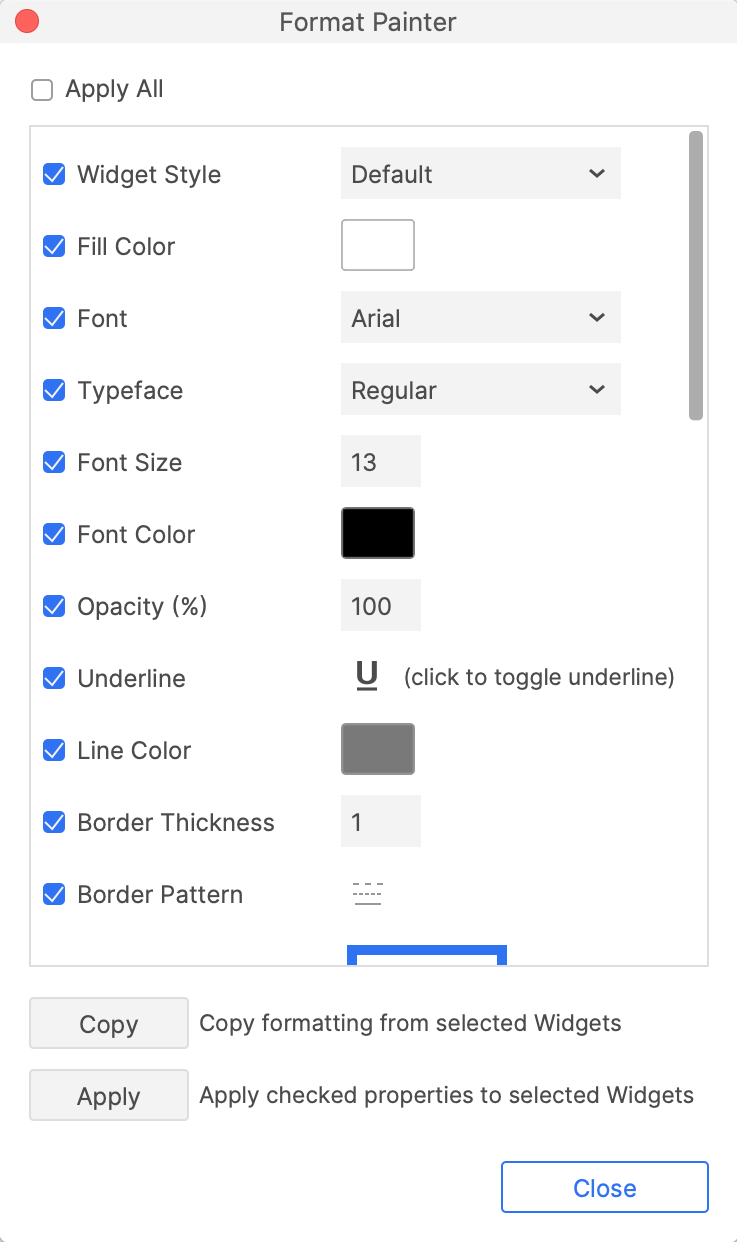
The format painter
The format painter, available in the main menu at Edit → Format painter, gives you finer control over how style properties are applied to widgets when copying and pasting.
You can choose which individual properties to copy and paste, and you can paste onto multiple widgets at once.
Additionally, the format painter allows you to copy and paste style effects.
Interactive style effects
"Style effects" are widget styles that are applied dynamically based on interactions in the web browser. They change the styling of a widget from its base style to an alternative style so long as the widget is in a certain state, such as moused over or disabled.
To learn more, check out the Style Effects article.