Component views
Component views are alternate versions of components designed for specific contexts. They allow you to create a component once and then rearrange, resize, and restyle its widgets to fit each context you intend to use it in. When you add an instance of a component to the canvas, you can choose which of its views to display.
Adding views to a component
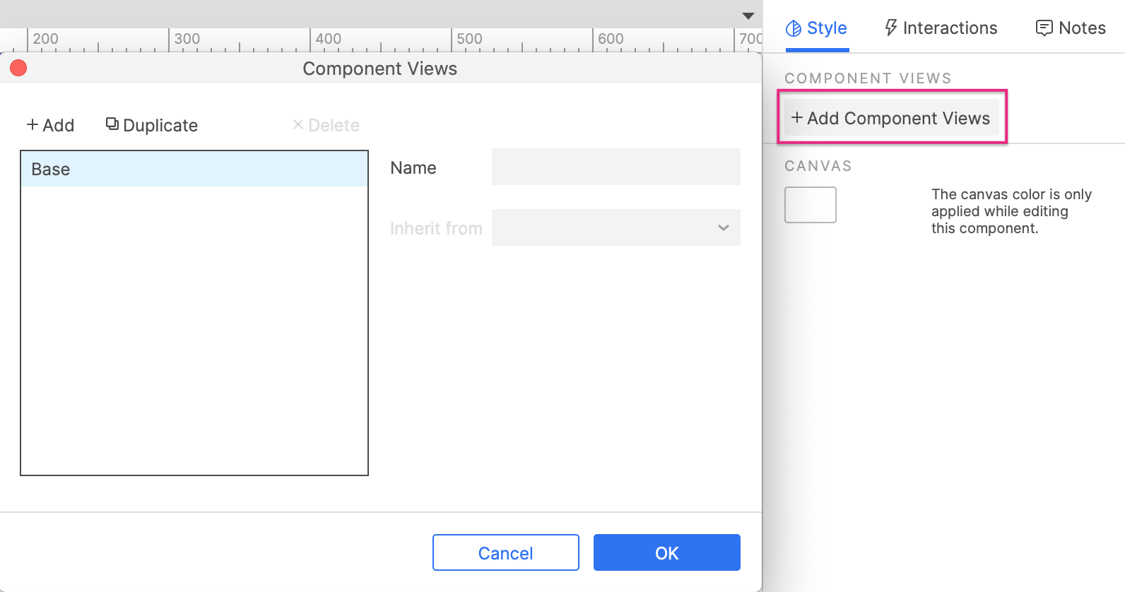
To add component views to a component, start by opening the main component on the canvas for editing. Click the canvas to focus the component itself, and then click Add component views in the Style pane to open the Component views dialog, where you'll create and manage your views.
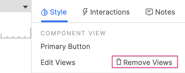
To remove component views from a component, click Remove views at the top-right of the Style pane.
Component view inheritance
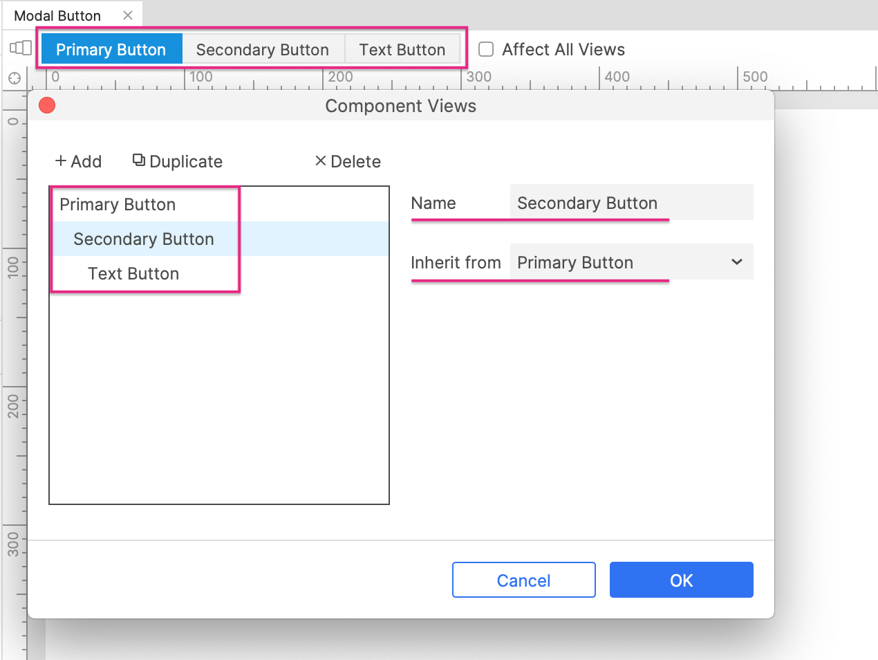
Component views are organized into chains of inheritance. The first link in the chain, the view from which all others inherit, is the Base view. Each view you add inherits its widgets and widget properties either directly from the Base view or from another view in the chain.
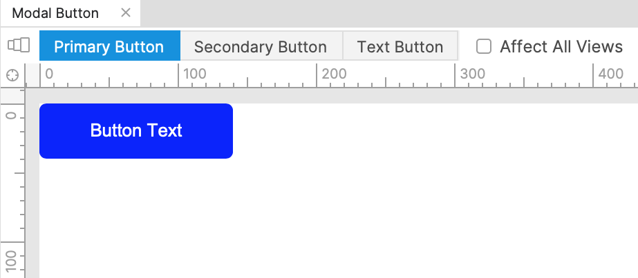
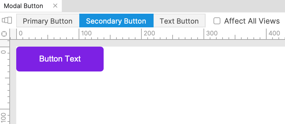
For example, the chain of inheritance for a button component might looks like this:
Primary button (Base) > Secondary button > Text link button
-
Edits made in the Primary button view would be reflected in both the Secondary button and Text link button views as well.
-
Edits made in the Secondary button view would be reflected in the Text link button view but not in the Primary button view.
-
Edits made in the Text link button view would only affect that view.
Editing diagrams in component views
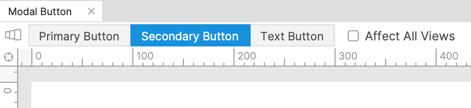
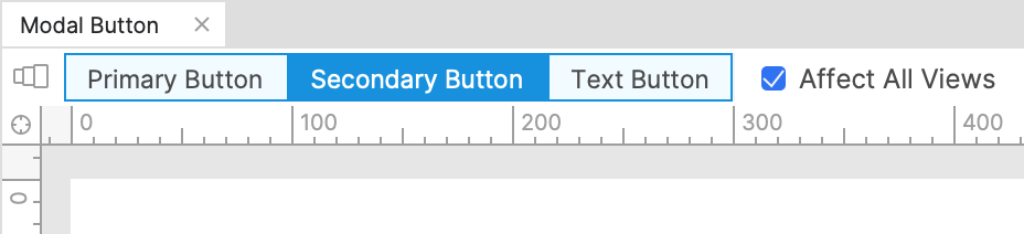
Once you've added component views to a component, you can access each view by clicking its name at the top of the canvas. The color of a view's name indicates whether or not it will be affected by edits you make on the canvas:
- Dark blue: The view currently displayed on the canvas. Edits will affect this view.
- Light blue: The Affect all views checkbox is checked. Edits will affect all views.
- Grey: The Affect all views checkbox is unchecked. Edits will not affect all views.
Furthermore, if you edit a widget property in a child view, edits to the same property in a parent view will no longer affect the child view. For example, if you change a button's fill color to pink in a child view and then change that same button's fill color to green in the parent view, the button will still be pink in the child view, not green.
To take full advantage of the benefits of component view edit inheritance, we suggest you take a top-down approach to editing your diagrams, starting in the Base view and then working your way down the chain.
Cross-view widget properties
You can change the visual styling, size, and position of widgets freely across component views. Some widget properties, however, are always the same in every view. These include widget text, notes, and interactions/interactive properties. Making edits to these on a widget in one view will always affect all other views as well.
Additionally, special widget properties like the options in a droplist widget, the rows and columns in a table widget, and the nodes in a tree widget, are also shared across views.
If you need a cross-view widget property to vary across your component views, create an additional copy of the widget for each variation and use the "unplace" feature to choose which version of the widget appears in each view.
Unplaced widgets
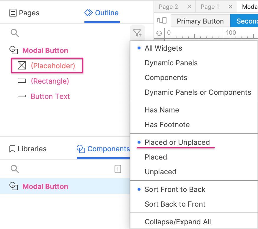
"Unplaced" widgets are widgets that are included in some of a component's views but not in others. Any widgets that have been unplaced from the current view are listed in orange in the Outline pane.
To ensure that you see both placed and unplaced widgets in the Outline pane, click the Sort and Filter icon at the top-right of the pane and select Placed or Unplaced.
There are two ways to unplace a widget from a view:
-
You can unplace a widget from the current view and its children by right-clicking the widget and selecting Unplace from view. You can also do this by selecting the widget and pressing DELETE.
-
If you add a new widget to a child view, the widget will be automatically unplaced from all parent views (unless Affect all views is checked).
If you DELETE a widget from the base view or while Affect all views is checked, the widget will not be unplaced; instead, it will be deleted from all views.
You can place an unplaced widget in the current view and its children by right-clicking it and selecting Place in view.
To delete a widget from all views entirely, right-click it and select Delete from all views. This will completely remove the widget from the component instead of just unplacing it.
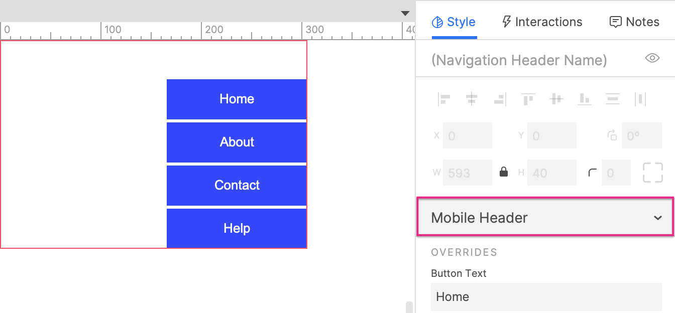
Choosing a component view on the canvas
When you add a component instance to the canvas, use the Component views dropdown in the Style pane to choose which of its views to display.
Component views and adaptive views
You can set up your component views to work in conjunction with your adaptive view sets. Make sure that your component views have the same names and inheritance structure as your adaptive views, and your component views will switch automatically in the browser along with your adaptive views.